Dropbox Website Redesign Campaign
Dropbox has an exciting new look to share, and we were thrilled to be a part of unveiling it. We wanted to support the new UI with an architectural angle: a bit like a tour through a home, we carry viewers through different rooms where new features are allowed to shine bright. Collaborating closely with our friends at Fuzzco, we developed a 60 second hero animation that supported dozens of down-funnel assets for an expansive marketing campaign.
We hope you’re as excited to open this box as we are.
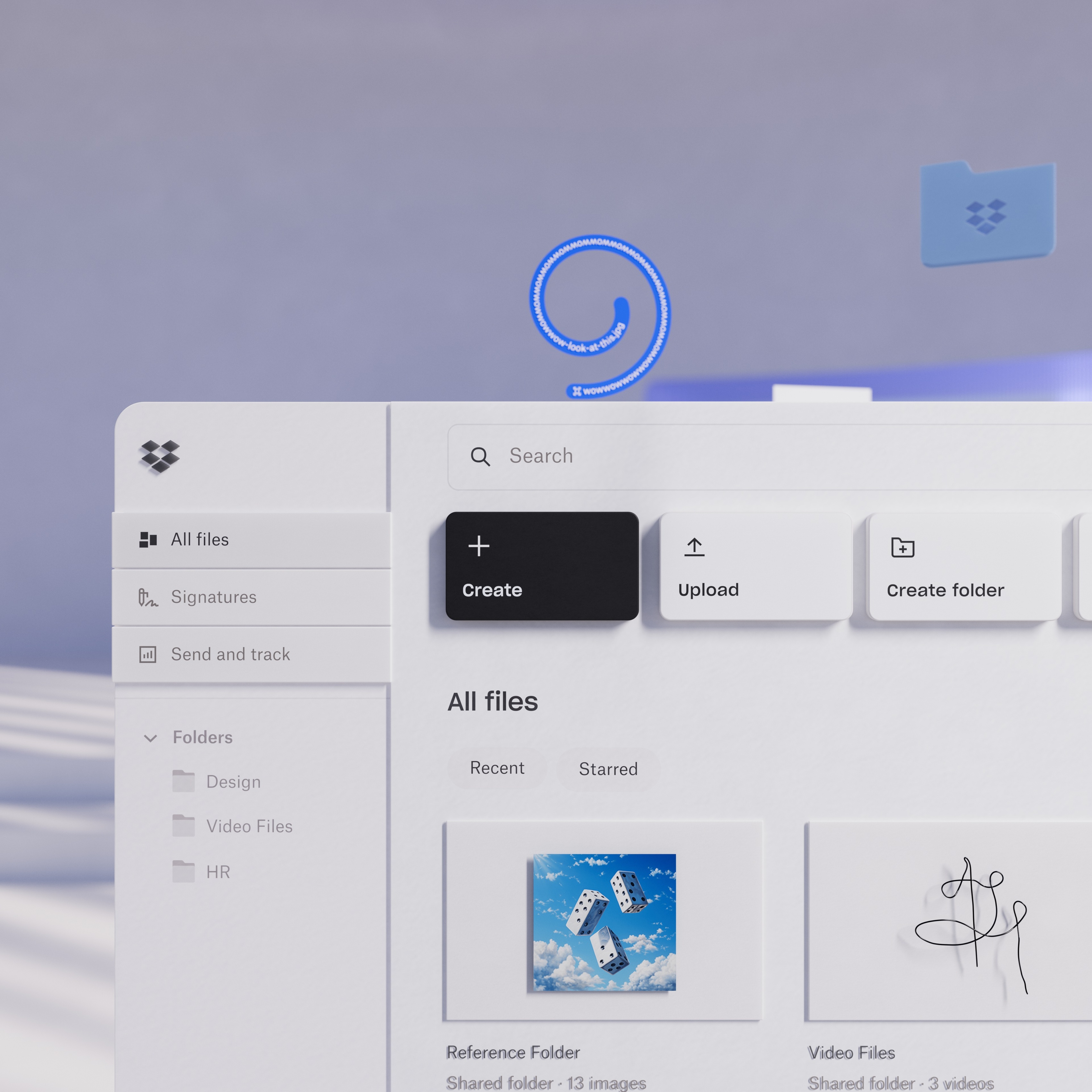
The File Storage Room
In the Dropbox home, the File Storage room is a gallery-like architectural space which functions as a subtle backdrop to our vibrant cast of "characters" in the form of files and UI elements.

Portals & Materiality
The ways in which we move through the world, and the materials that form it, are just as important to the storytelling as the architecture of our various rooms. Dynamic camera movements carry us through portals reflecting user navigation and evoke the quick syncing of files. Materials such as fluted glass and metal are used to abstractly convey Dropbox's encryption and file privacy features, and files/folders have a paper-like quality which draws a parallel between your digital data and its physical counterparts.
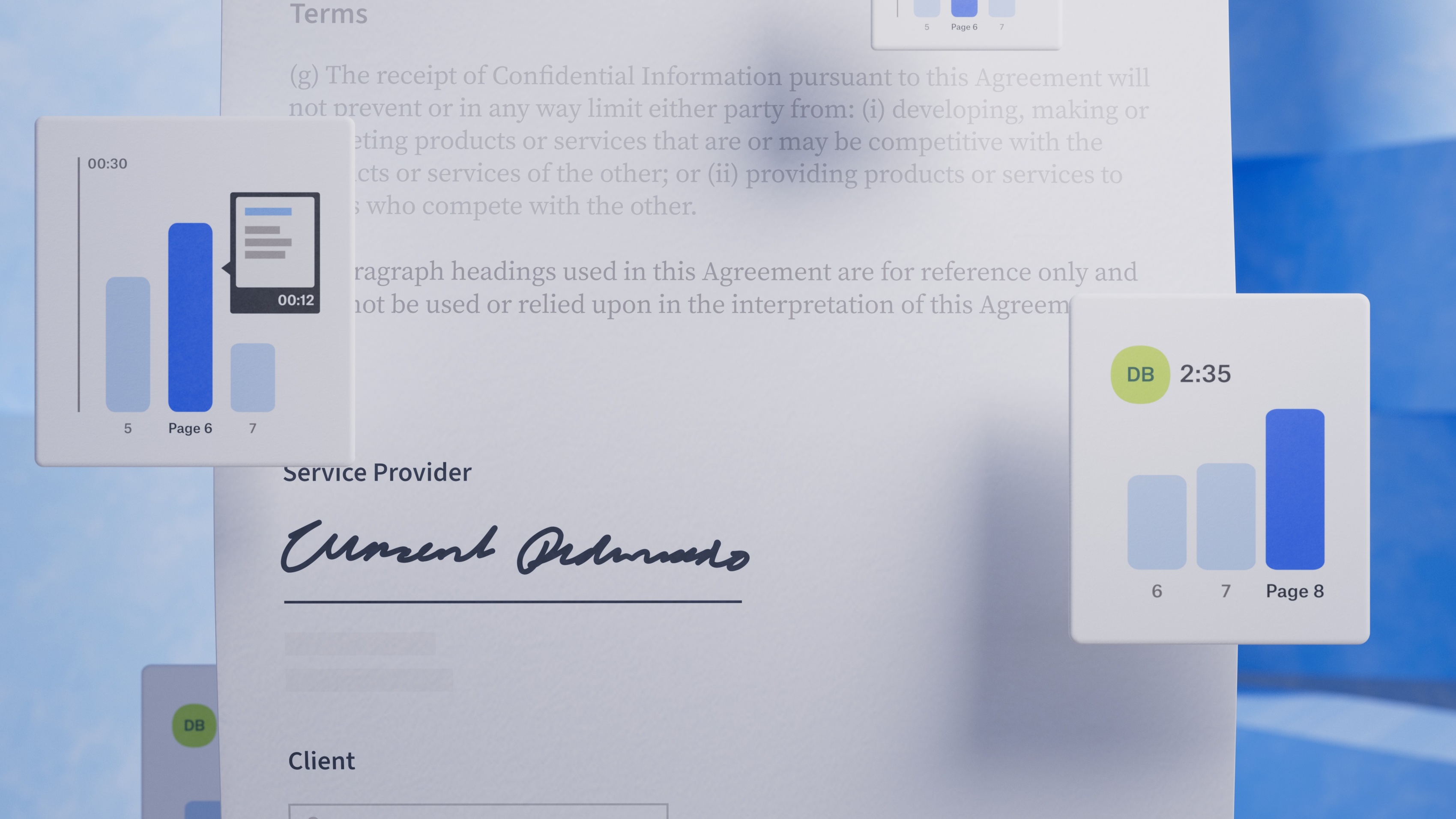
The “DocSend” Room
The DocSend room is meant to evoke a surreal floatiness - retaining an architectural feeling while introducing a calming painterly quality meant to reflect the ease of using the product.


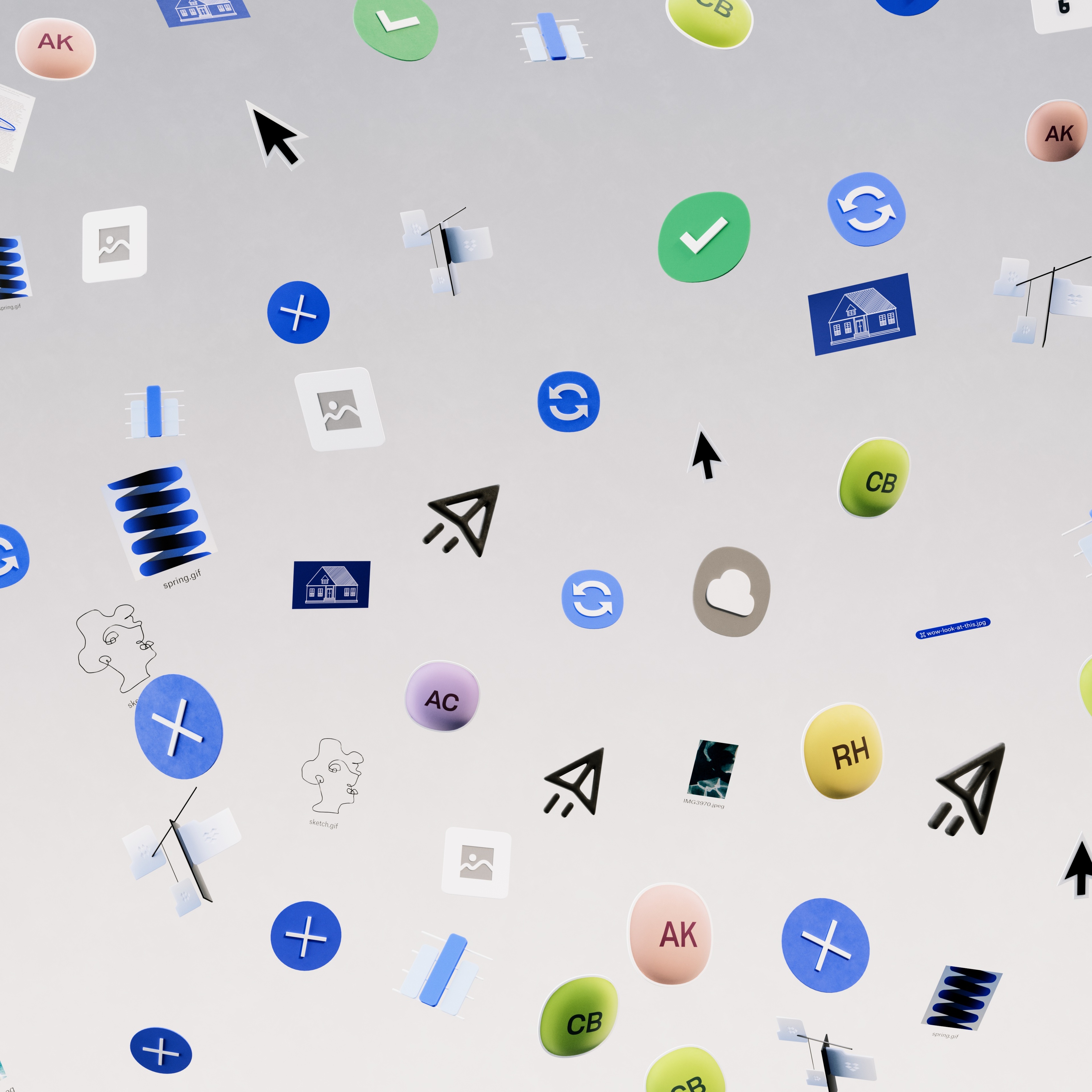
A Living World
The Dropbox world doesn't just exist in static form - like a real house it really comes to life as the user interacts with it. It was important for the architectural UI to demonstrates that it's here to facilitate the user's goals. As a mouse cursor hovers over buttons, they inch forward in anticipation, and bounce happily when clicked. Even something as formal as a signature on a document can become something magical, inflating when placed - as if to represent the cascade of outcomes that might arise from that simple interaction.
Gravity
Using Dropbox should feel like a weight is lifted from you, facilitating your process and allowing your creativity to flourish unbounded. In the world of Dropbox, there is no gravity holding you down, and your work can manifest in endless and evolving forms.
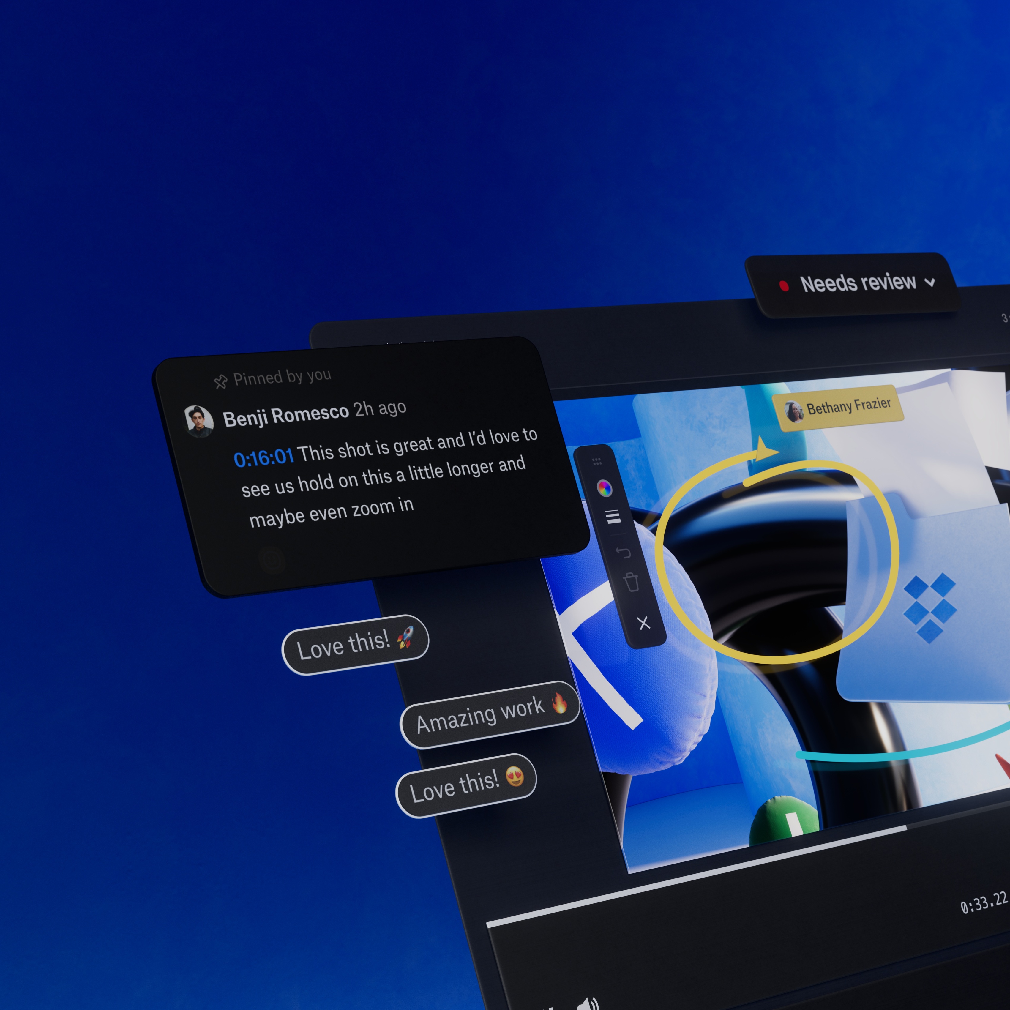
The Replay Room
Now we turn down the lights to focus. Looking sharp even in dark mode, we take this moment to celebrate a collaborative opportunity.

Campaign System
This video is the flagship component that carries all down-funnel campaign elements. It’s a revolutionary way to show Dropbox UI, and one we think makes the product feel sophisticated and elegant - and fun.
Services
- Branding
- Motion
- UI/UX
- 3D
- Creative Direction
Client
Dropbox