Expensify Brand Identity
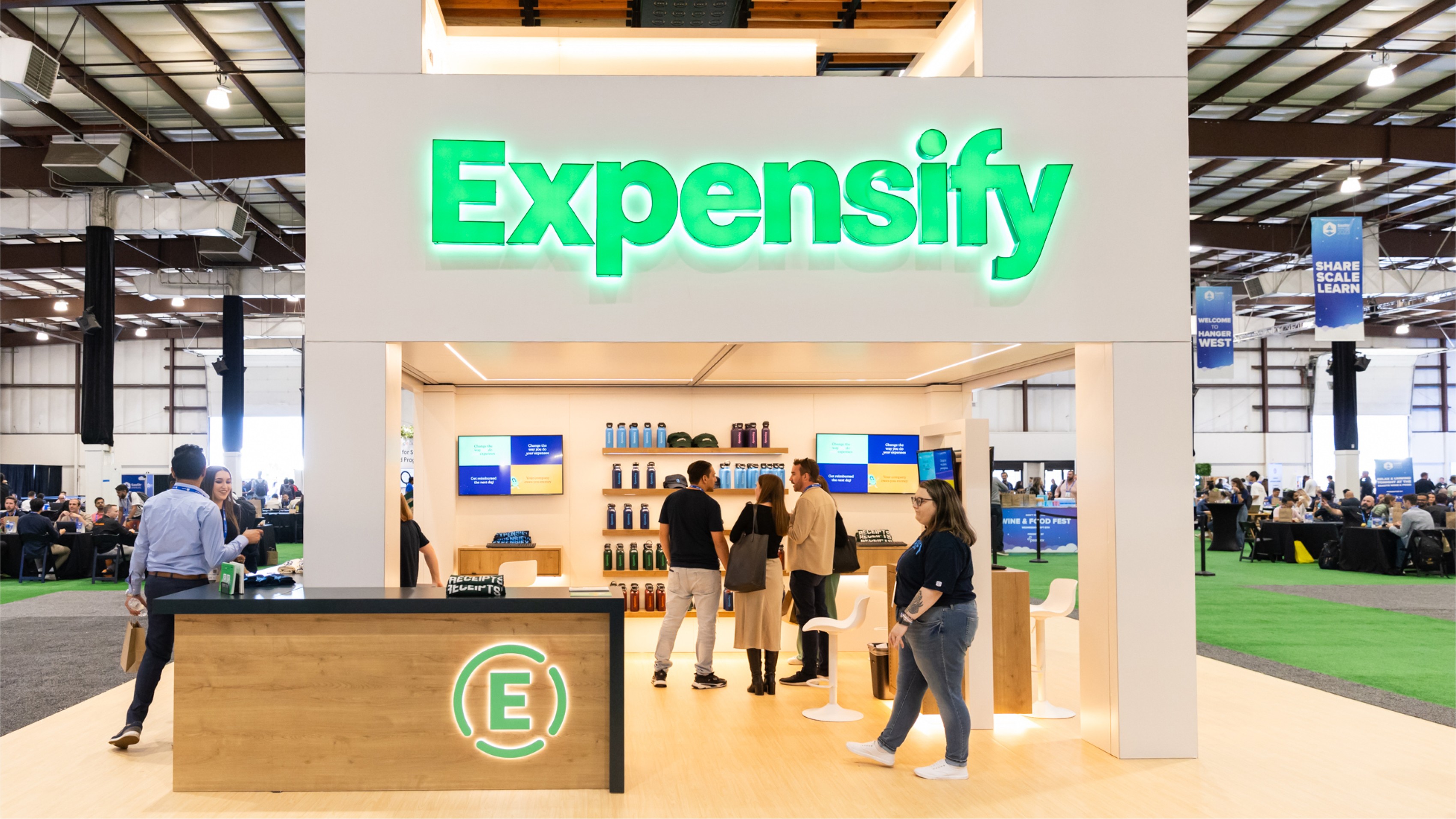
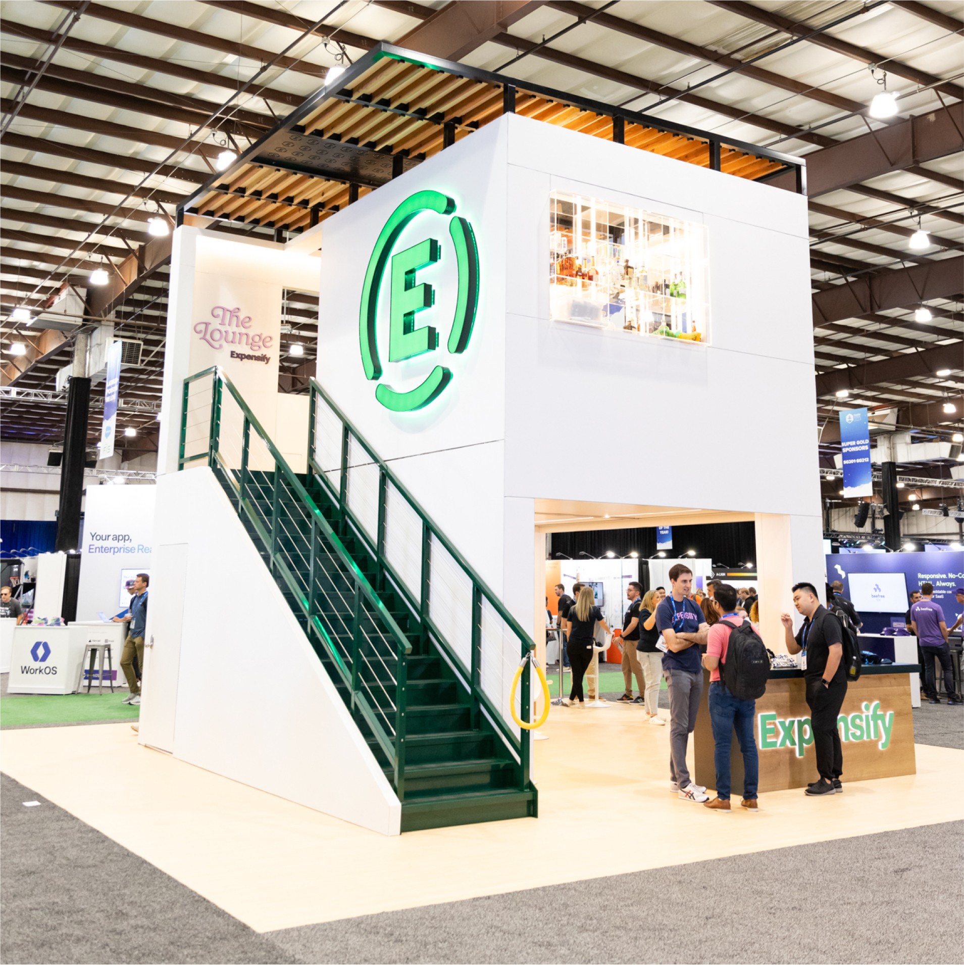
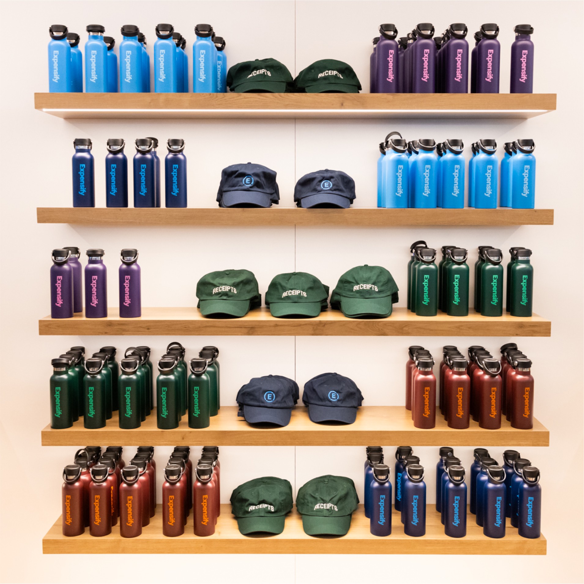
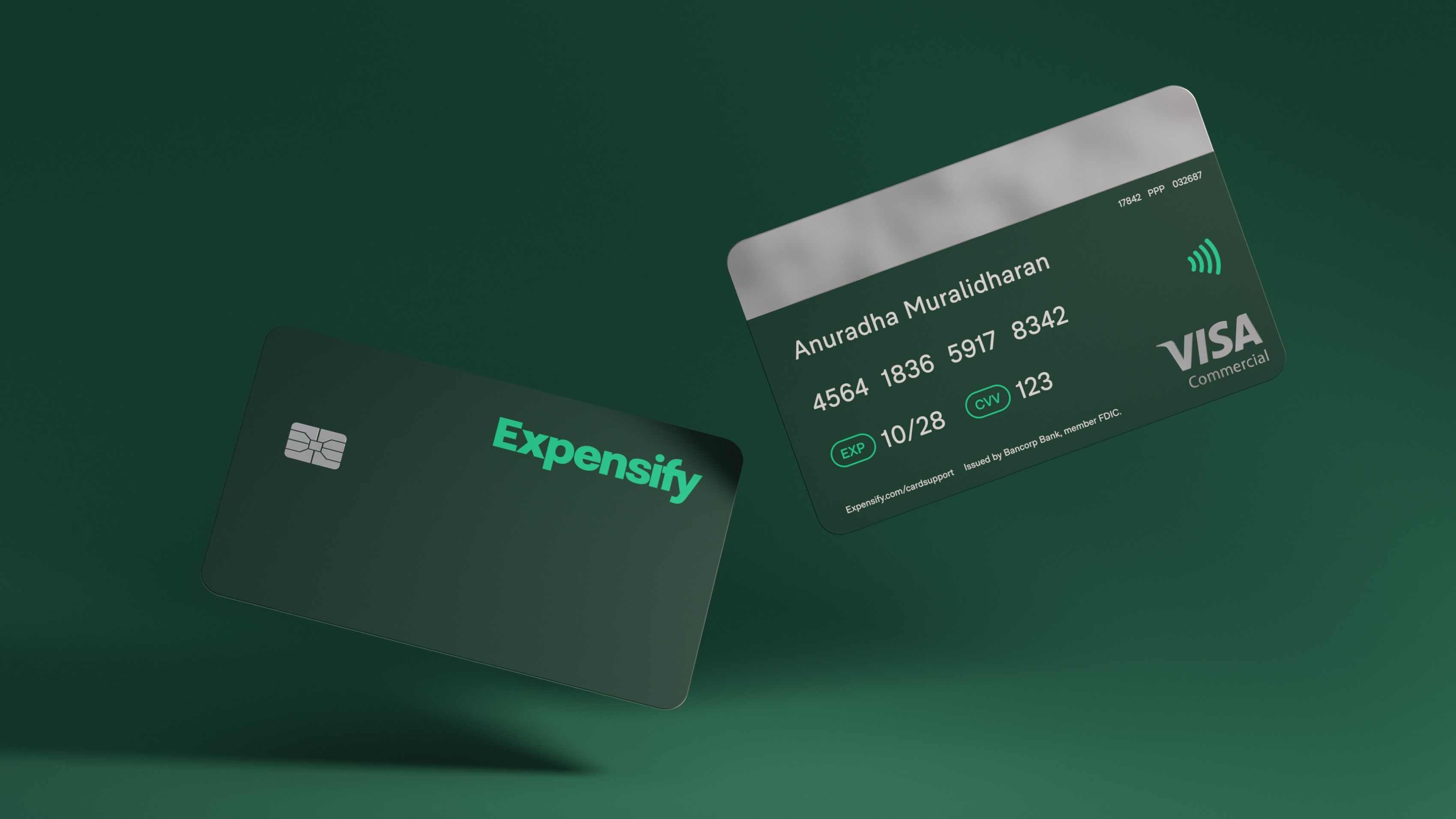
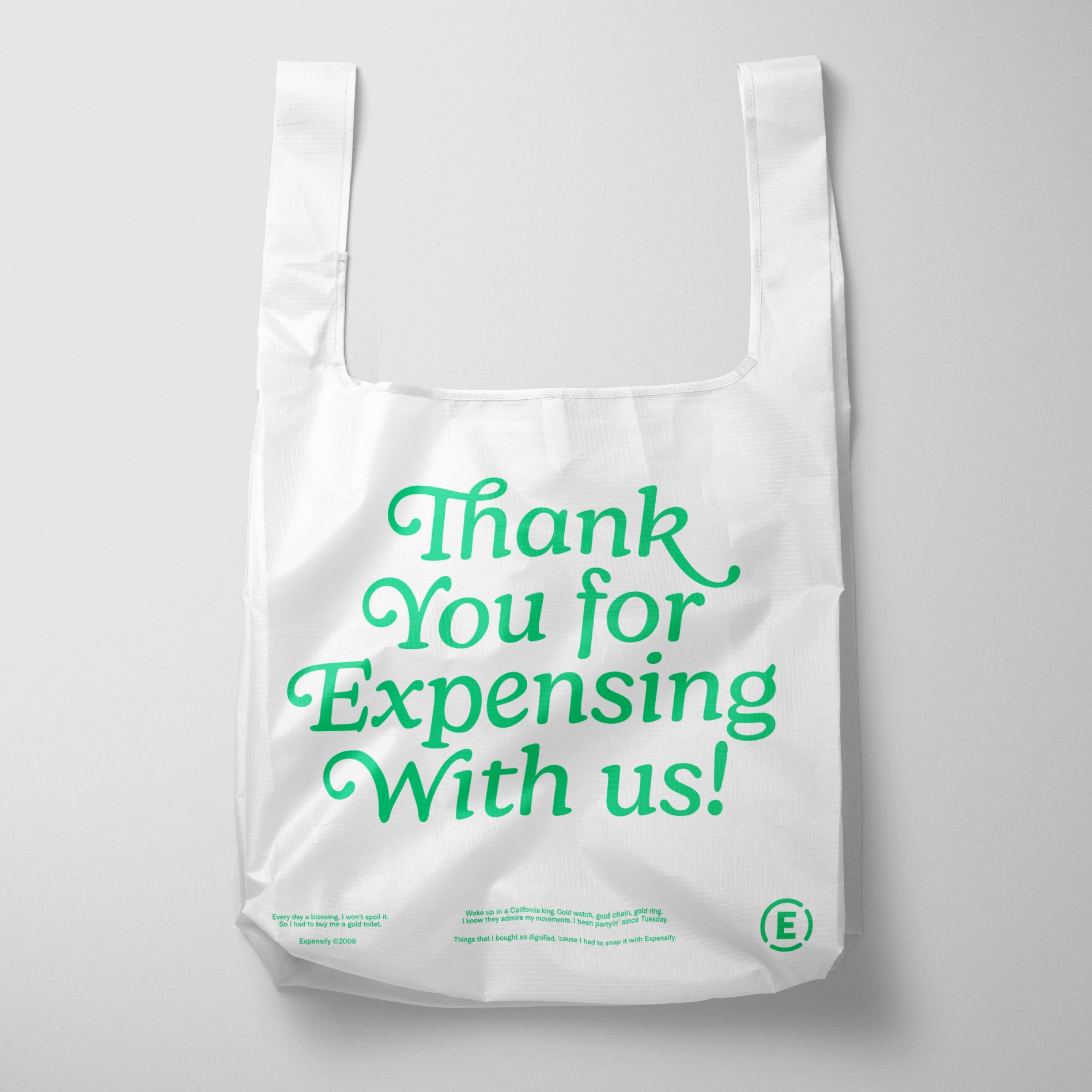
We were thrilled to work closely with Expensify on a new brand system that would be so robust, no stone was left unturned: from wordmark and iconmark, to expanding the color palette, to explorations of how the brand works in motion, to in-app and real world executions. Their software has been a game changer for expense reporting since 2008, but after a taste of a Super Bowl commercial in 2019 that wasn't afraid to get a little wacky, they were ready for the rest of their brand to evolve. This is a company that knows no bounds, and the brand system should reflect that. This case study deserves a deep dive, so get scrolling.
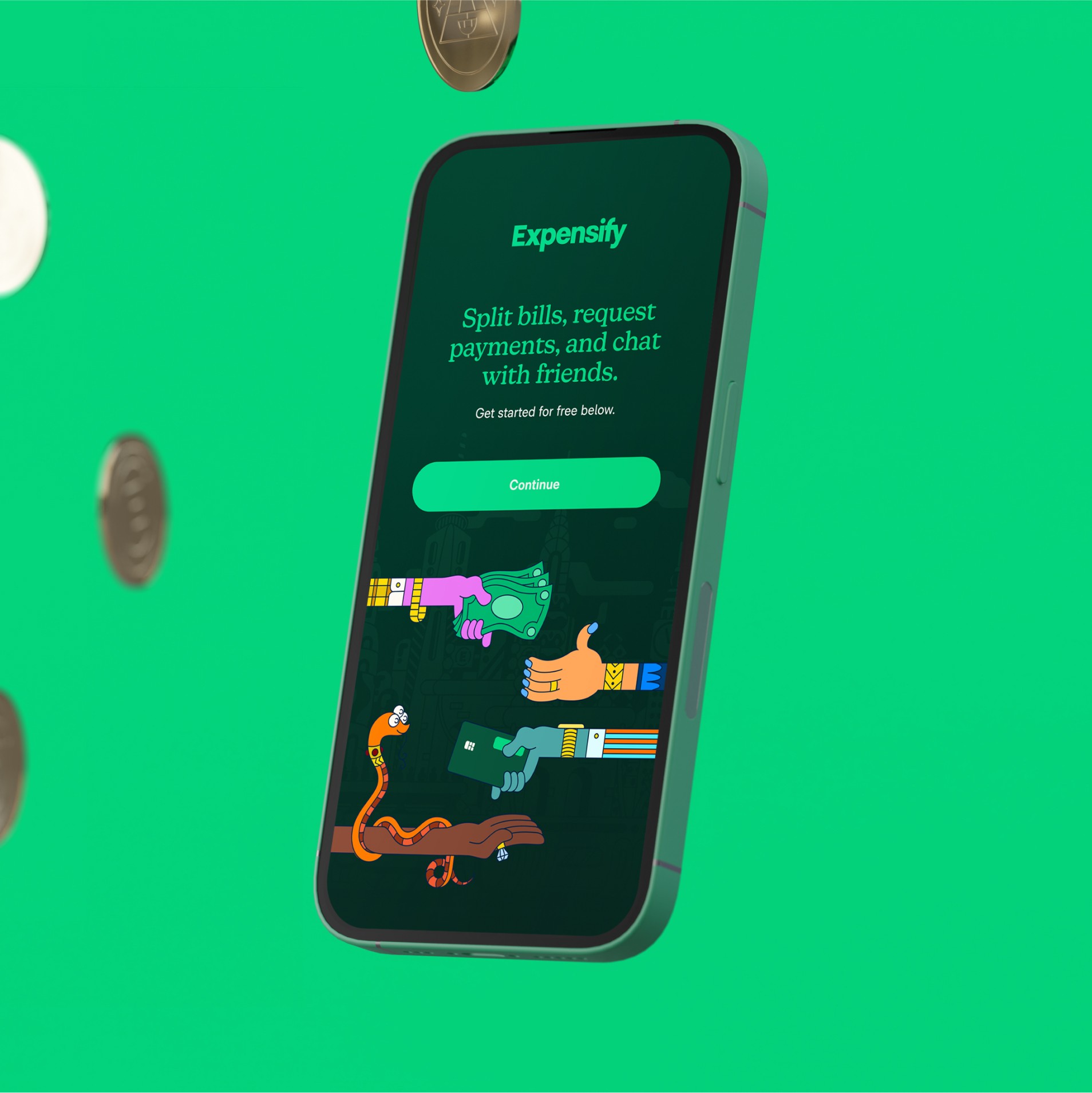
Custom Type
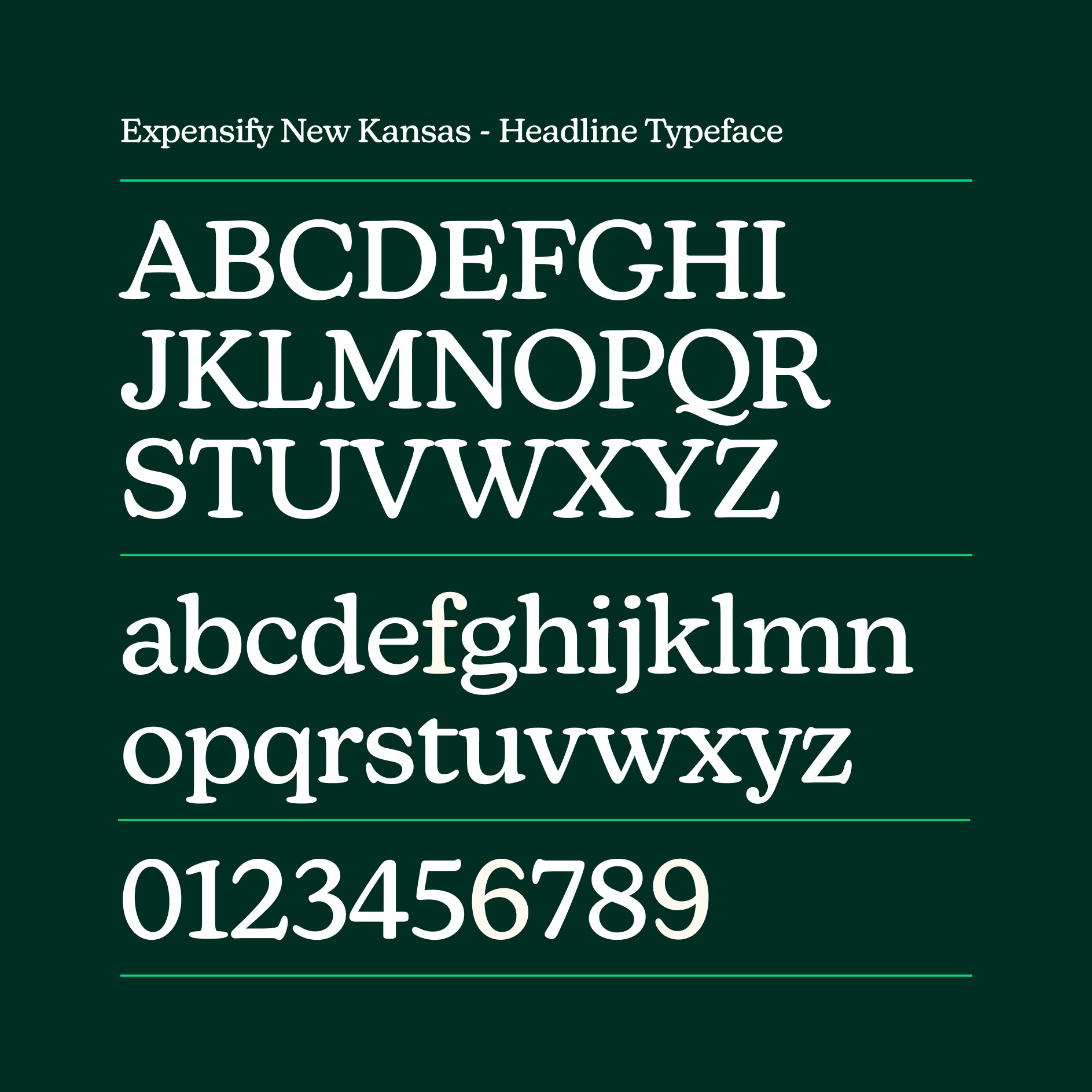
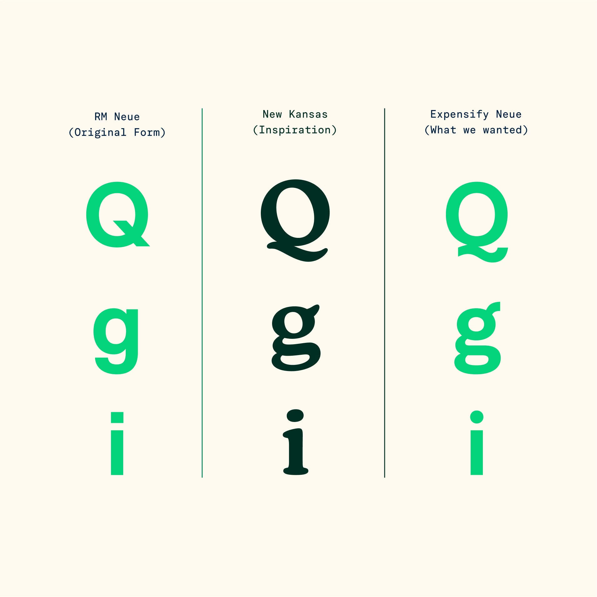
Typography is one of the brand system’s most important pillars. New customized type families, Expensify New Kansas, Expensify Neue, and Expensify Mono, pair harmoniously to balance the playful and utilitarian. Every fine detail was pored over while working closely with two type foundries, CoType and Newlyn. As a result, all of the typefaces have shared DNA in their letterforms, and look great both in digital and physical executions.
Color
Green is the hero color, infused across all aspects of the brand, and we’ve established a few tonalities to complement it. We expanded on the color palette to accommodate for a variety of situations, with considerations for marketing, product design, accessibility, and illustration, including an inclusive range of skin tonalities for human characters.
We love the vibrant color palette, and also love to see it used in the best possible way. That’s why we established a few primary color combinations and usage guidelines, which allow for lots of flexibility but take out the second guessing when anyone on the team is creating a new asset.
Illustration
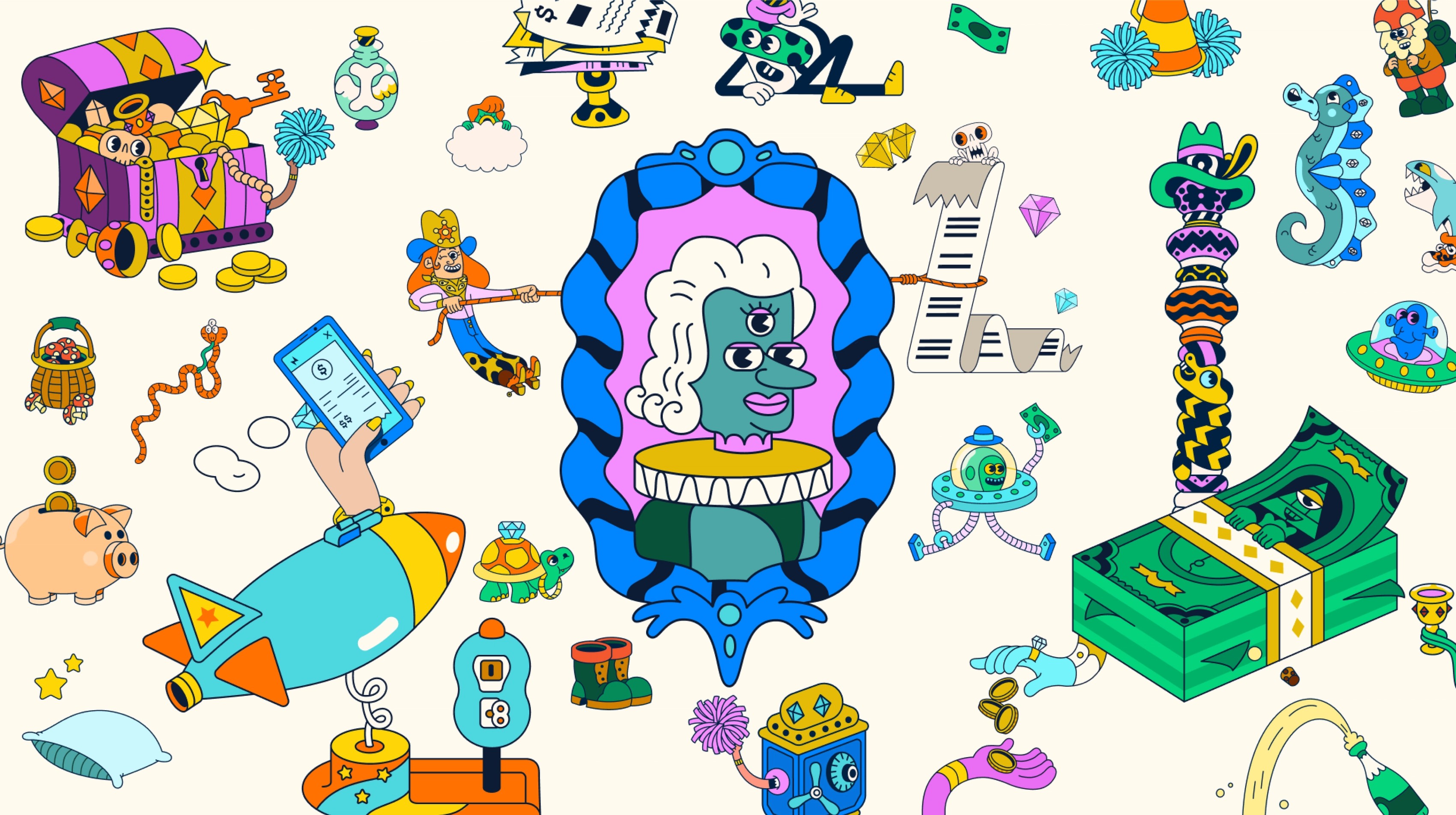
After the success of Expensify's 2019 Super Bowl commercial, they couldn’t stop thinking of the portal to the animated universe that they had just opened. A world where expense reports don’t suck, and receipt scanning can be done in outer space.
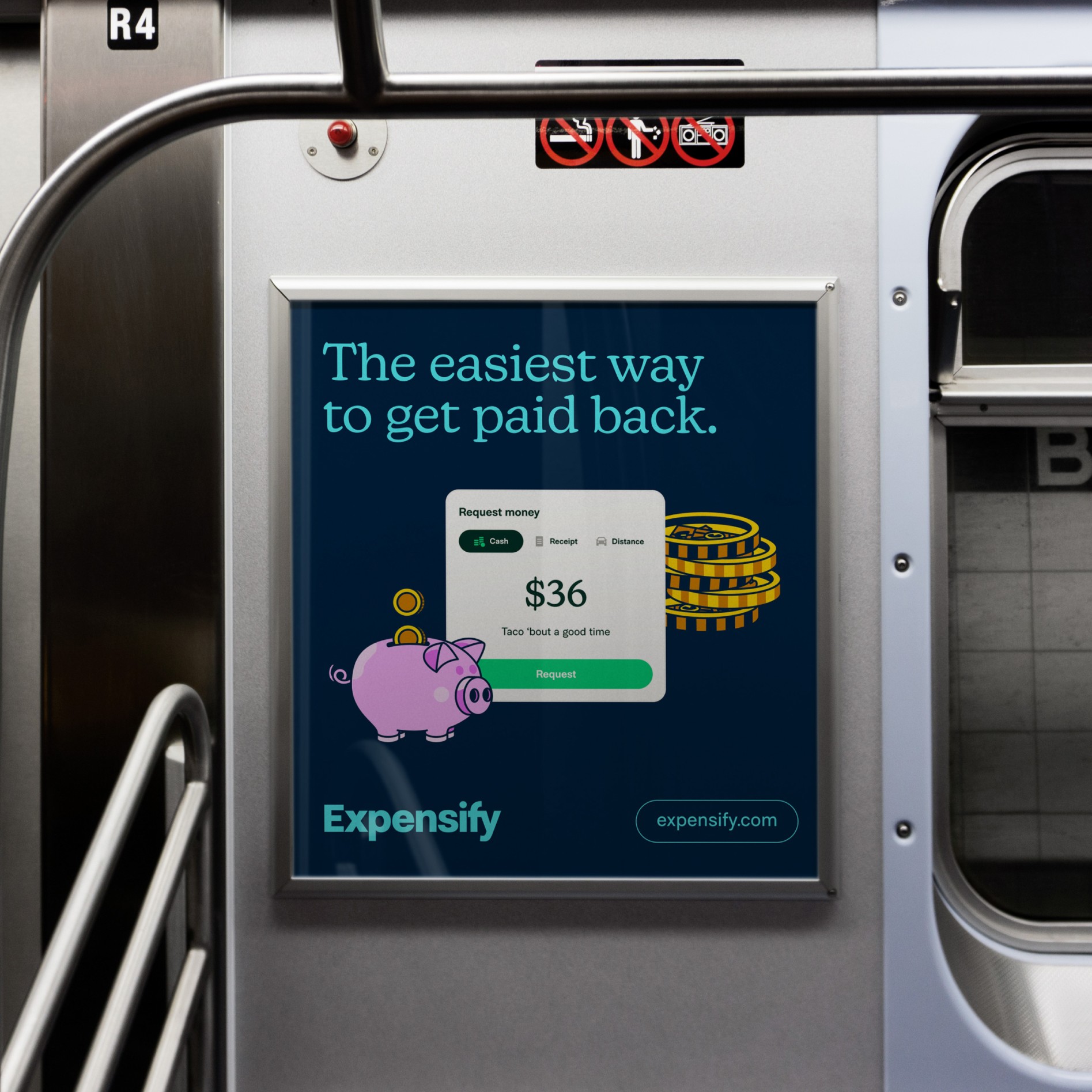
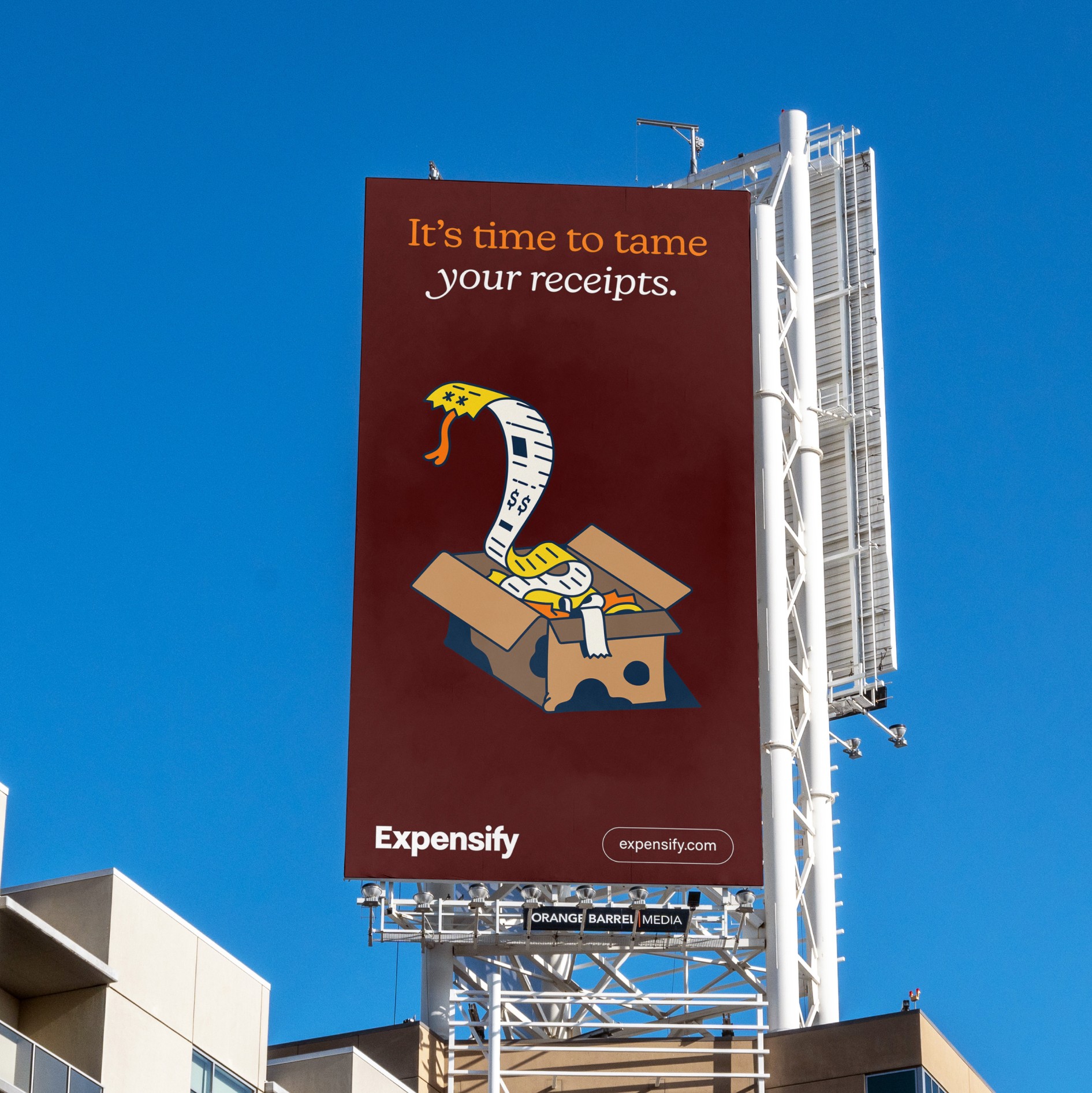
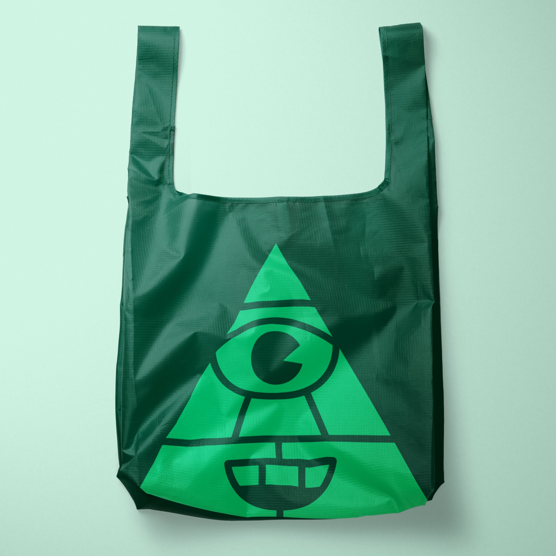
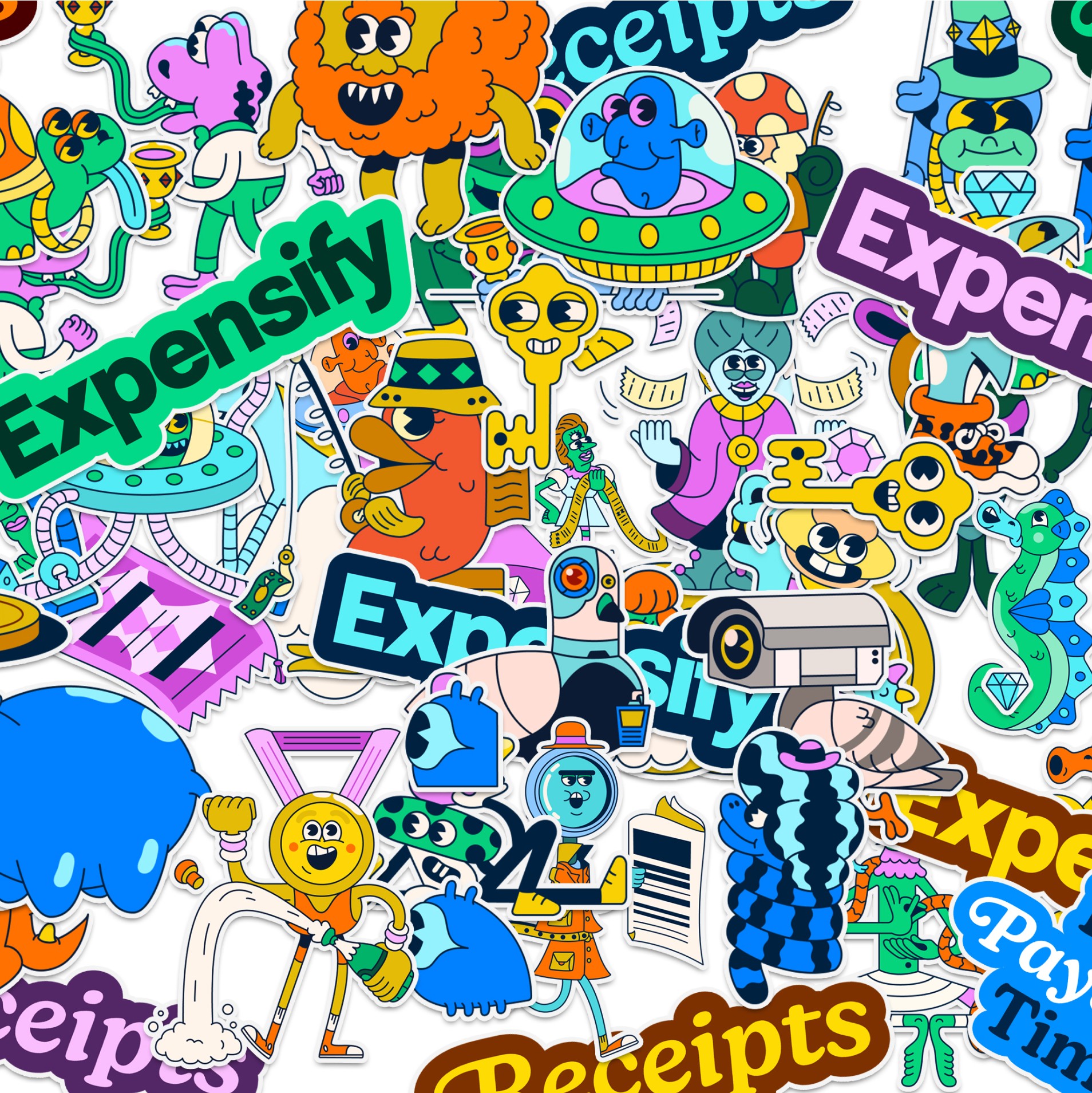
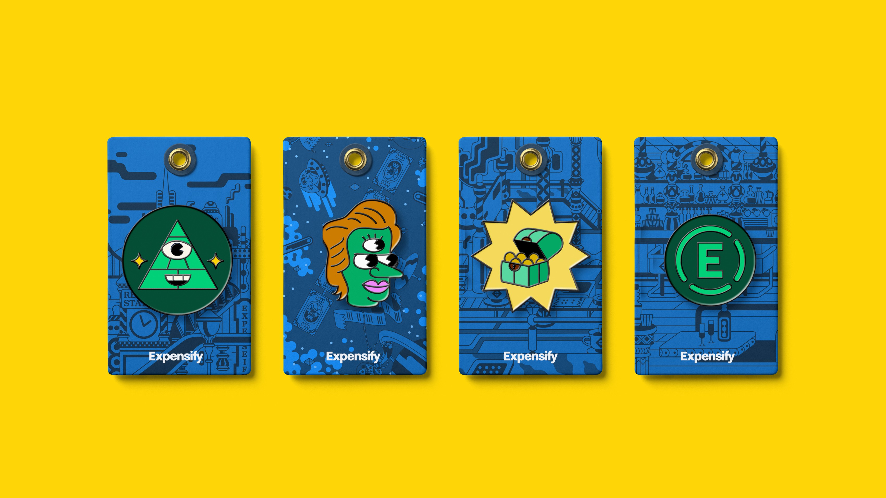
For the new brand system, Expensify teamed up once again with Augenblick Studios. Together we dove much deeper into this world, introducing a new set of characters, vignettes, and backgrounds, as well as simplified illustrations that can work iconographically, that bring the product and messaging to life.

Layout System
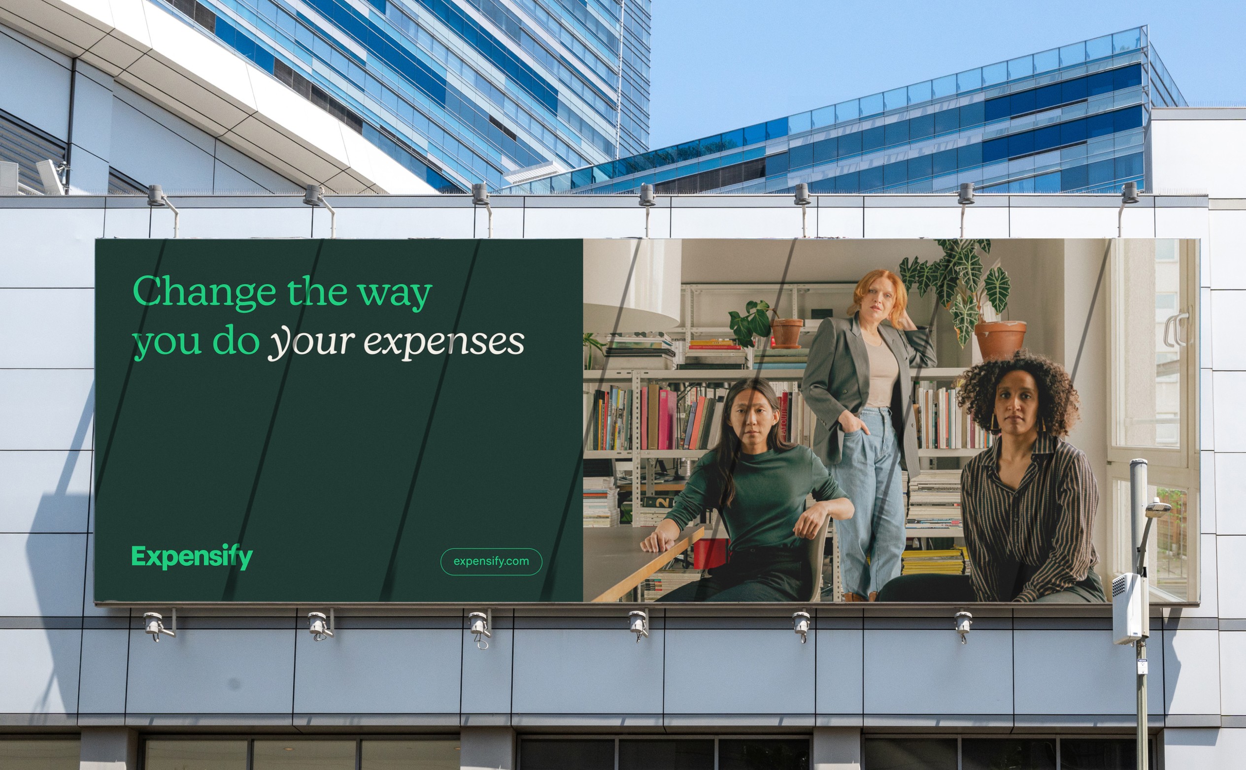
With all of the main elements in place, we started to look at how to use them in a way that doesn’t feel overwhelming, but still retains the playfulness - and power - of Expensify's brand voice.
With a carefully considered suite of layouts, ranging from the most minimal and utilitarian to the highly expressive, anyone on the team can generate a variety of assets that always feel consistent, whether they’re seen on a phone screen or a billboard in Times Square.

Product
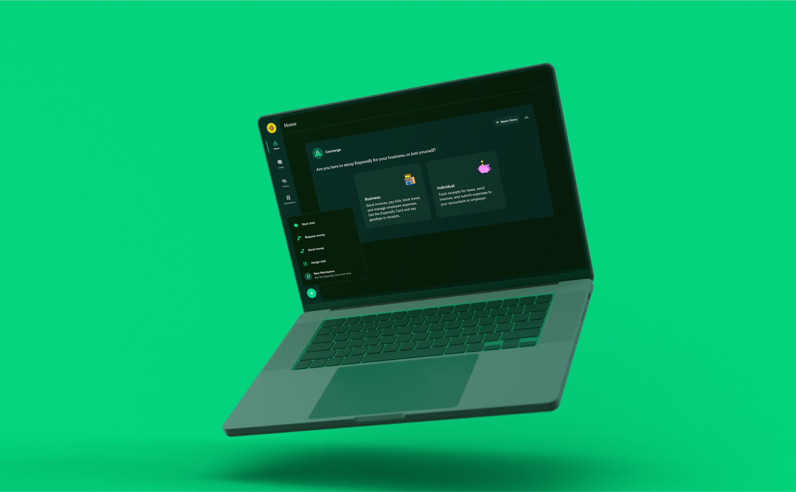
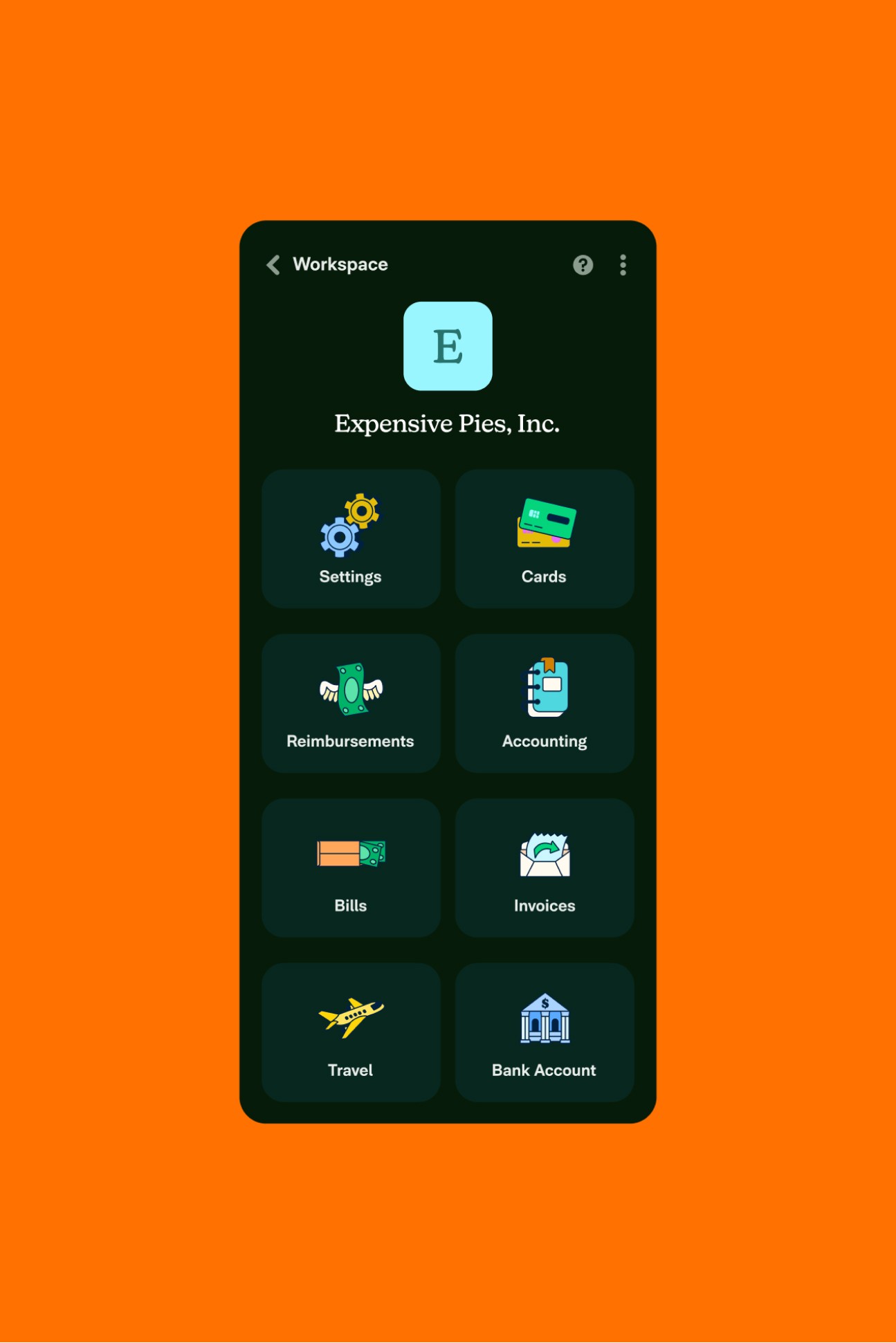
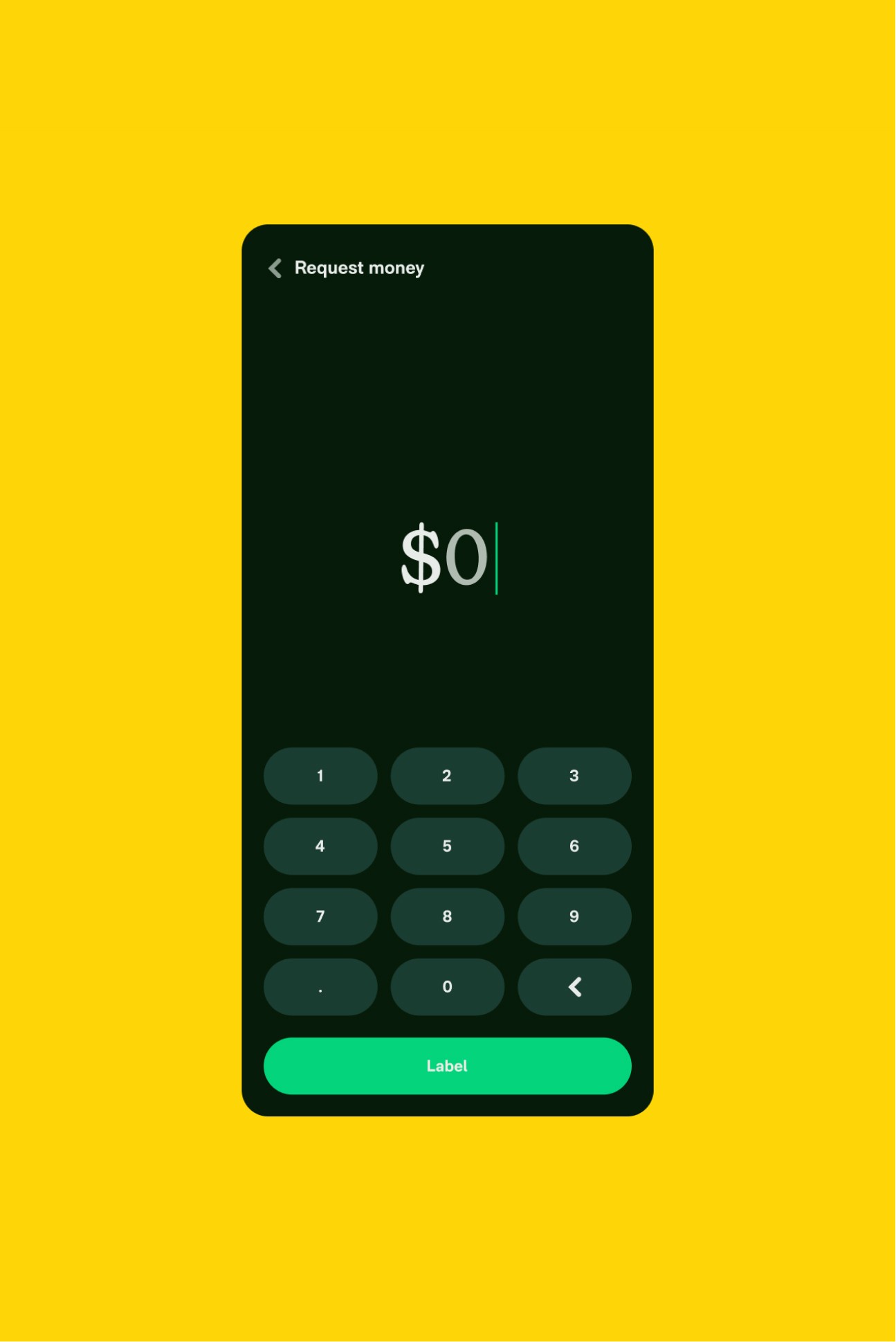
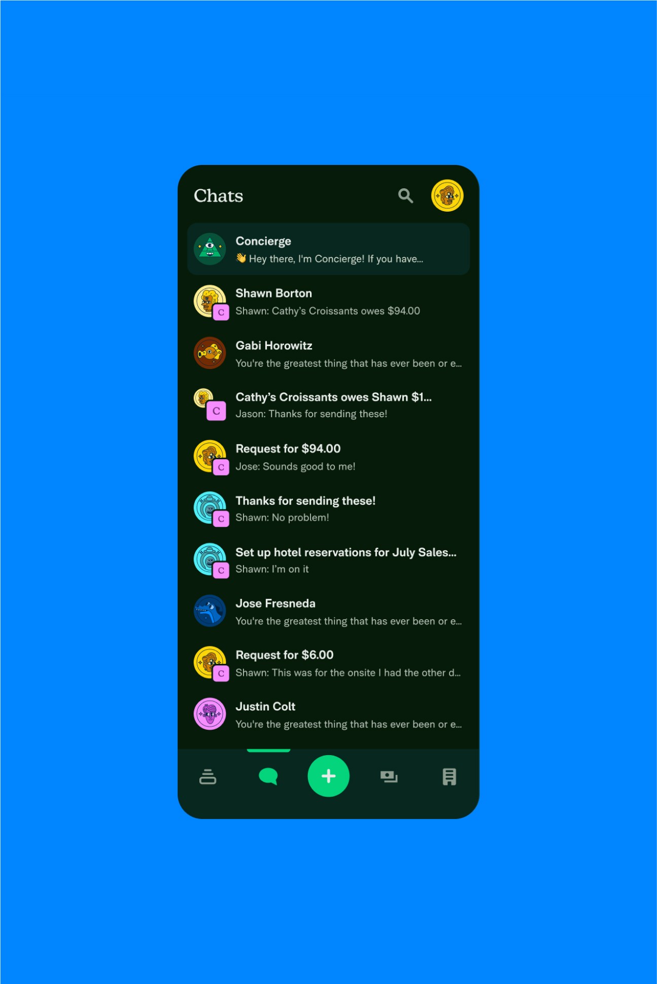
Last, but definitely not least, the Expensify user experience has been fully redesigned to bring new levels of joy and practicality in equal measure into the core product. Everything from the colors and type sizes, down to the sound that plays once a user sends in an expense report, has been fully thought out to reflect who Expensify is - and their bright future.
Client
Expensify