Starry UI & Animations
“We want you to visualize the Internet.” Yep. That’s seriously what the Starry team told us in our first conversation. We told them, “that might be NSFW — but we’ll see what we can do.”
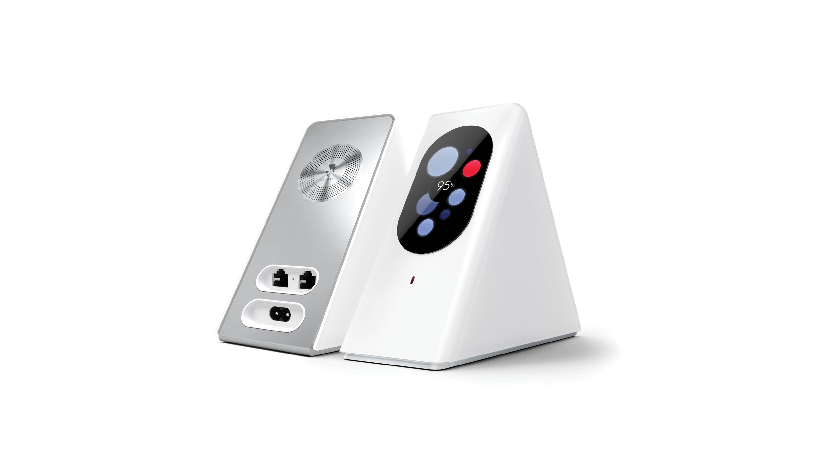
The Starry team had a truly rad mission — they wanted people to control and understand their Wi-Fi like never before. So they built a powerful router with a touchscreen display that was beautiful enough to showcase on a desk and simple enough for any mom to use. No more blinking lights to decode. Just a better way to stay connected to all the amazing stuff on the Internet (cat memes included).
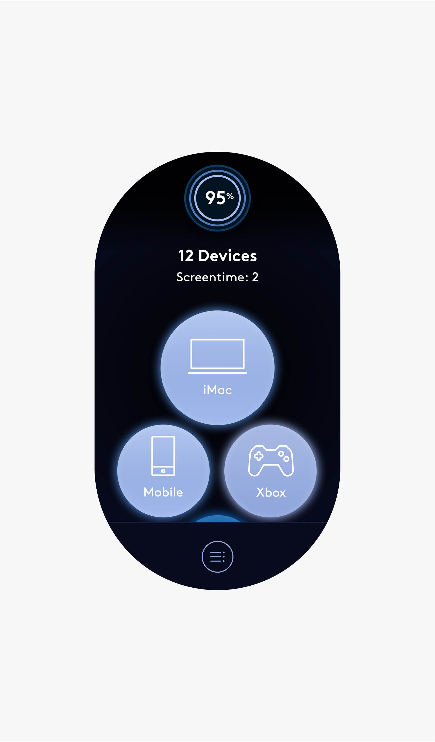
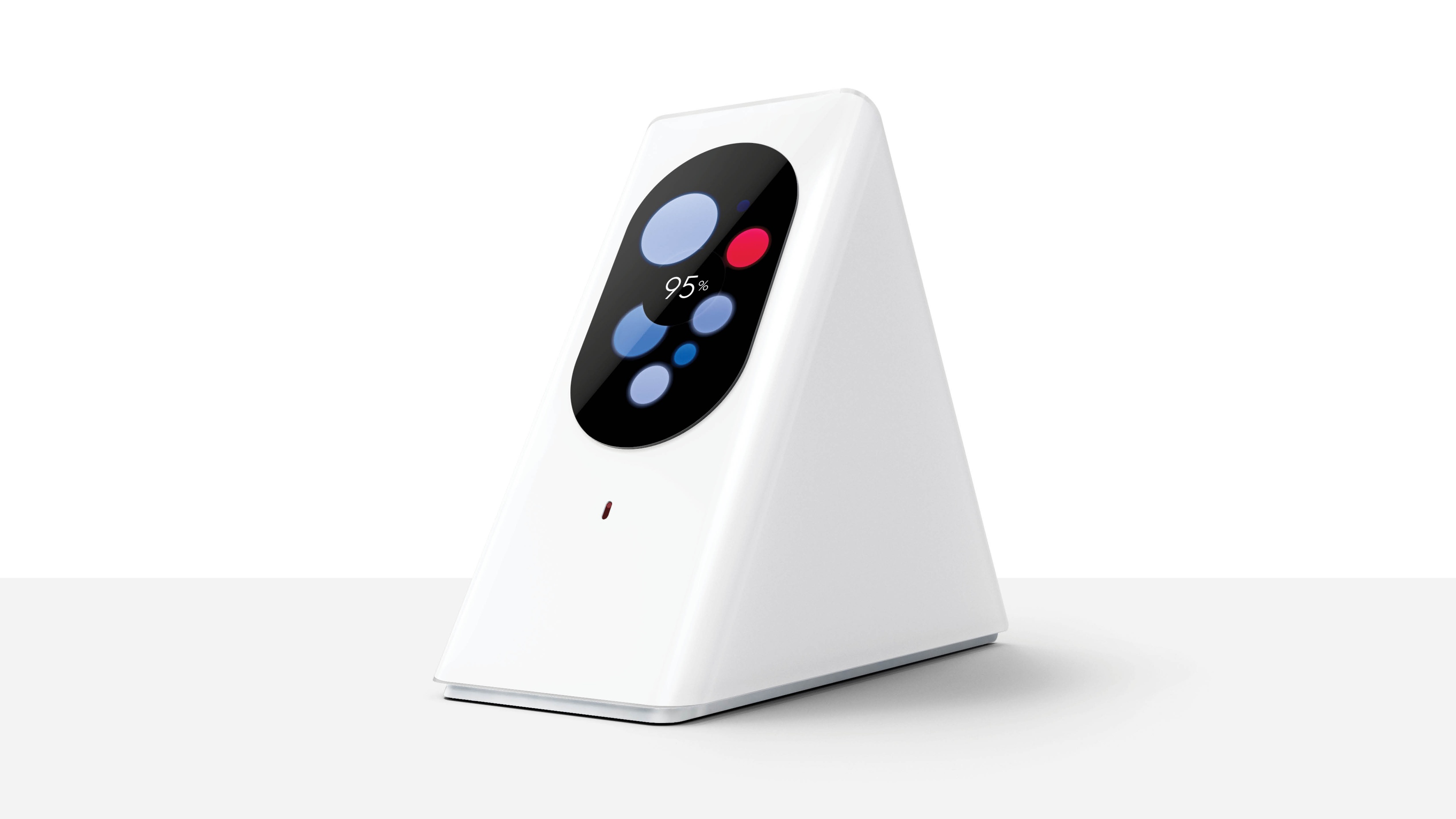
Through lots of testing and iterating, we discovered that the visualization of floating orbs (representing connecting devices) had a very immediate and beautiful quality. So this became our design language, with devices that are connected to a network would be represented by colored spheres, floating and drifting in space.
See, the Internet can be Safe For Work.
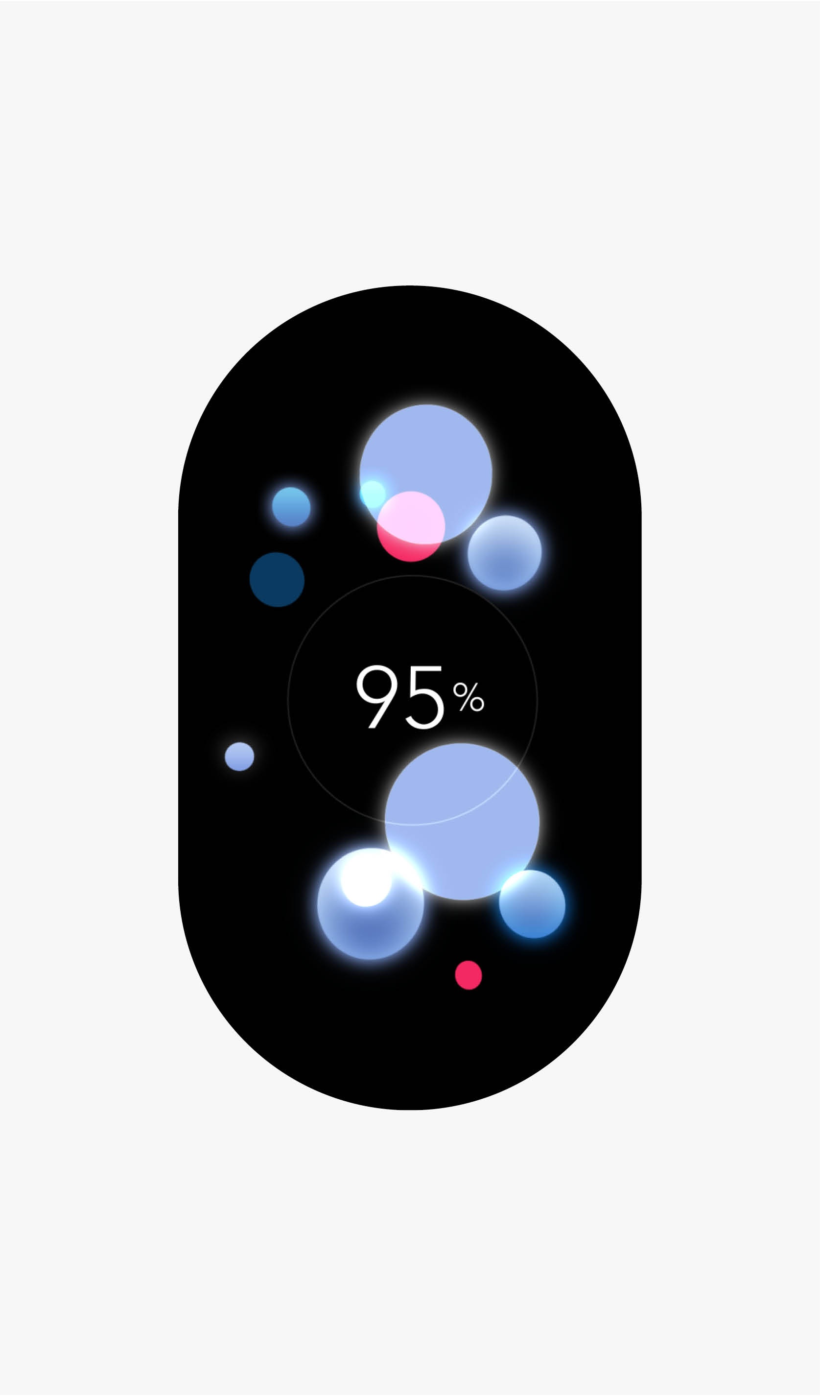
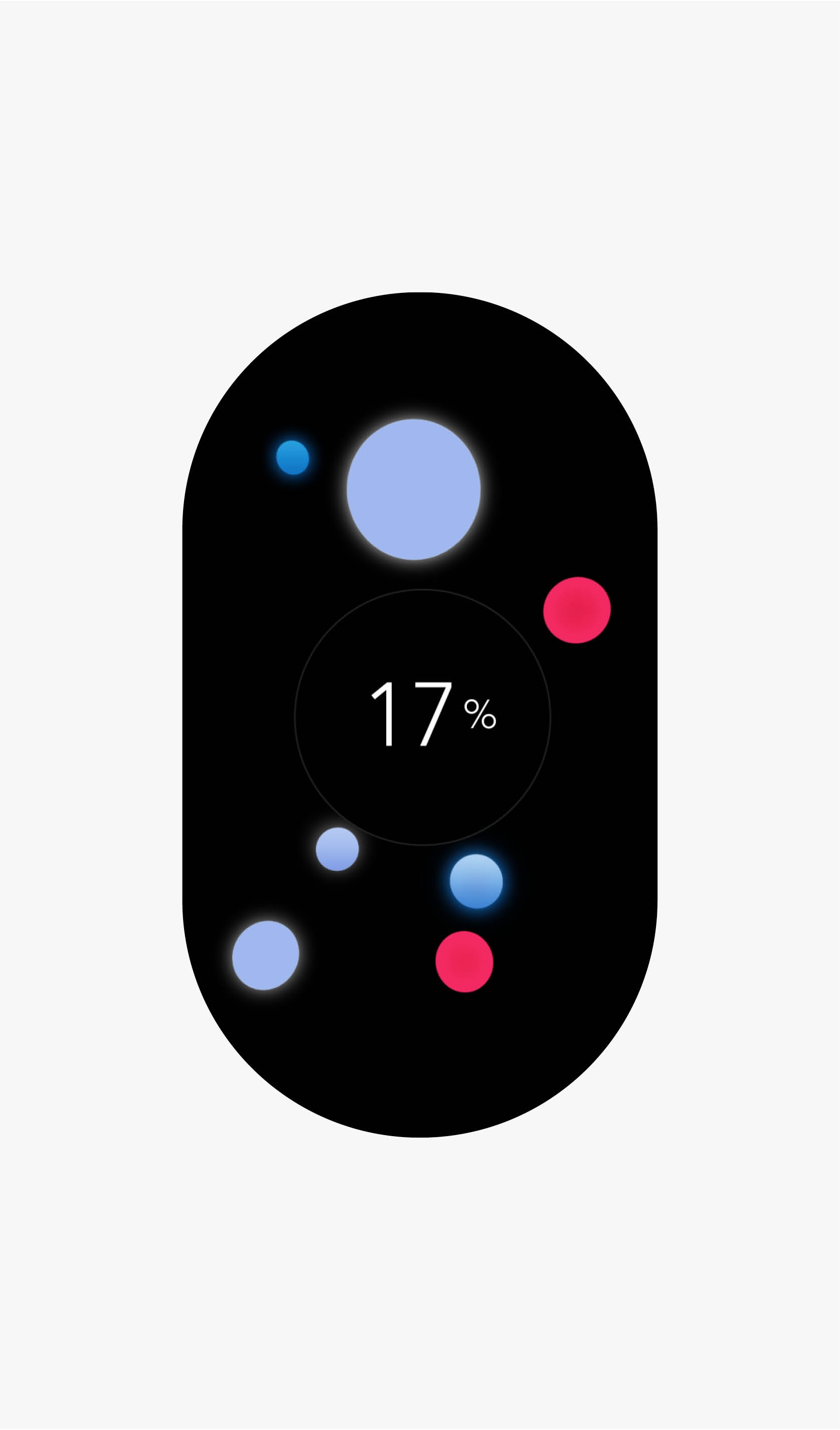
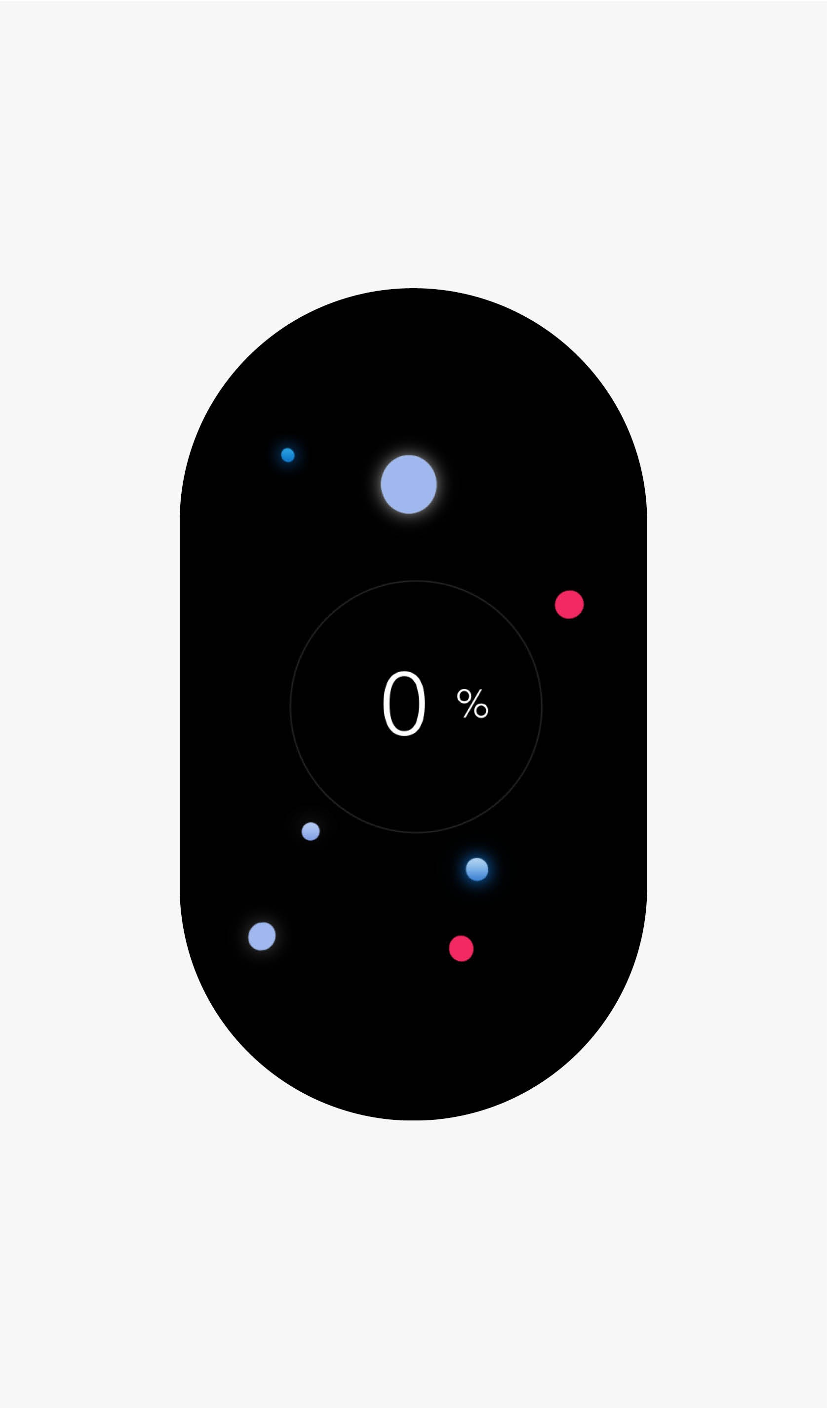
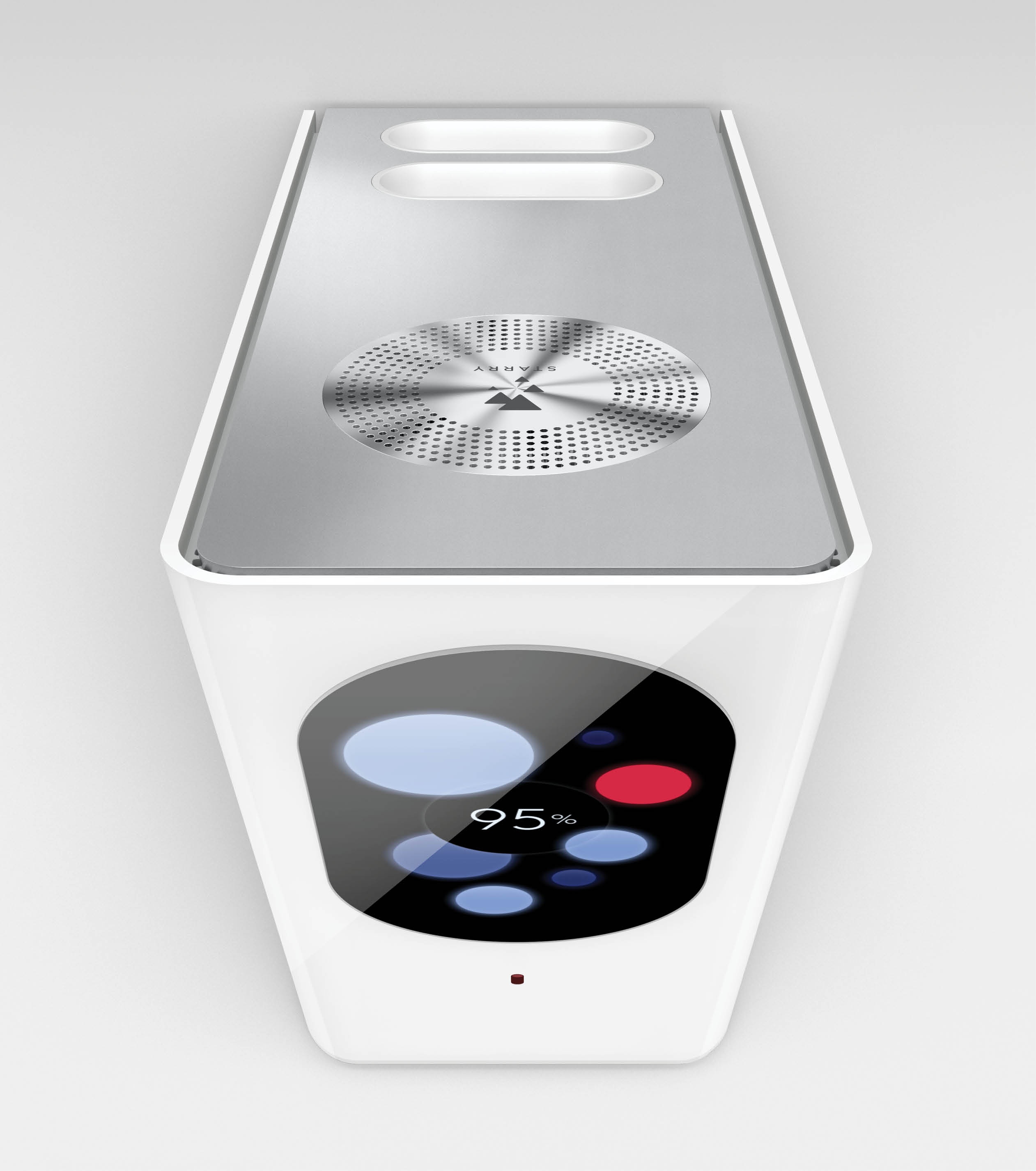

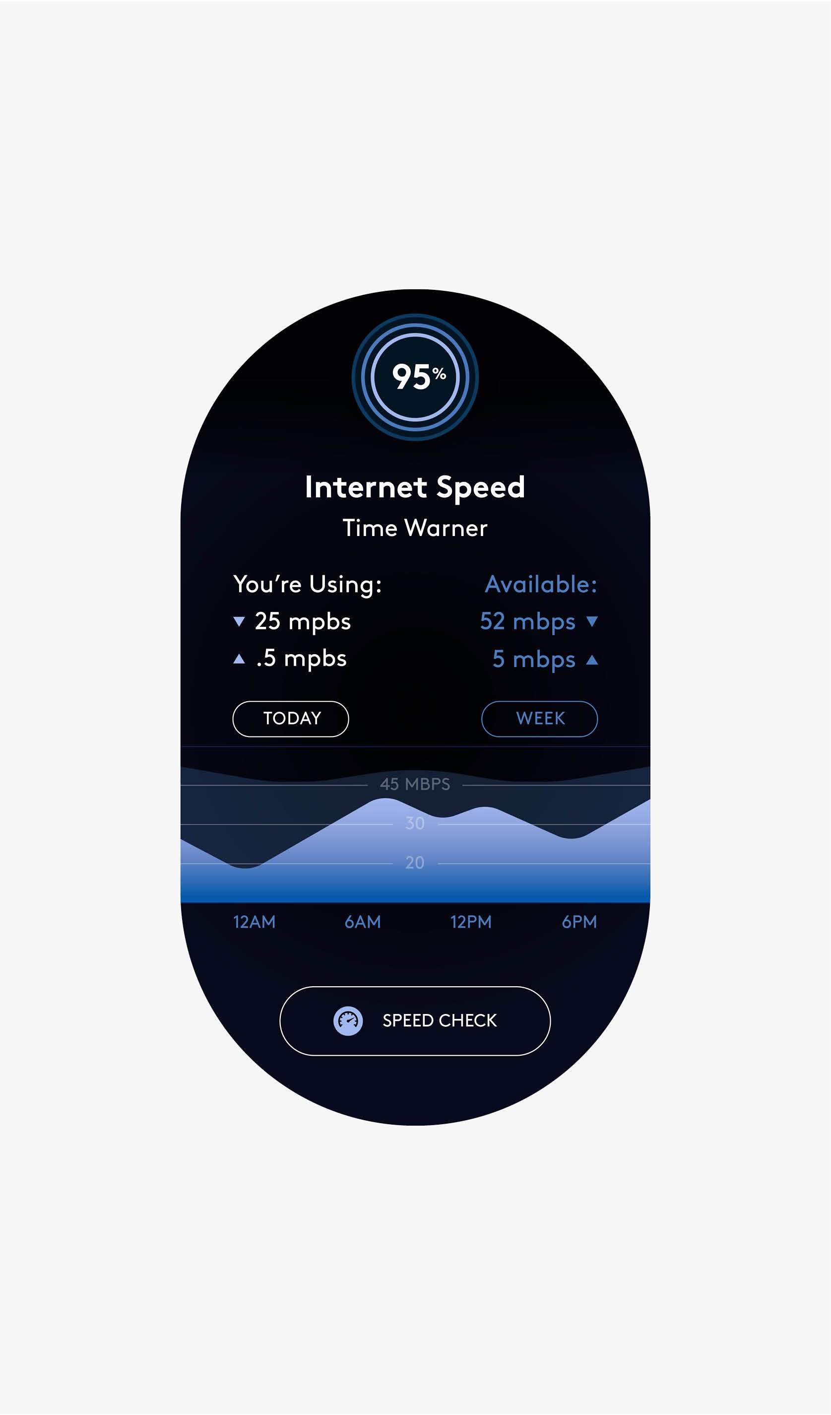
The color system also played a key role. We established that “healthy devices” represented their signal strength in shades of blue, and “problem devices” displayed a bright red, making it simple and intuitive for a user. This same logic would be carried across all data visualization: shades of blue meant everything was cool and red indicated there was a network problem.

Client
Starry