Antimetal
Bringing clarity to the very complex world of AI infrastructure.
About the project
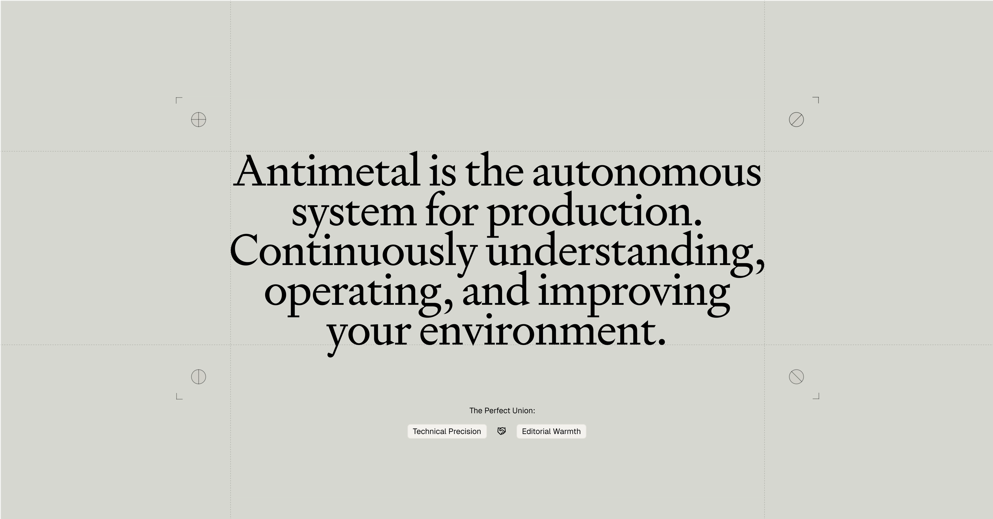
Antimetal’s product does a lot. Like, a lot. It monitors your infrastructure, finds problems, investigates what caused them, and fixes them all on its own. Honestly, it’s an incredibly impressive product, but potentially a lot to understand quickly. That’s where TCW came in, overhauling the website and refreshing the identity to make Antimetal easier to understand while still feeling as powerful and capable as the product itself.
Project Credits
Editorial Engineering
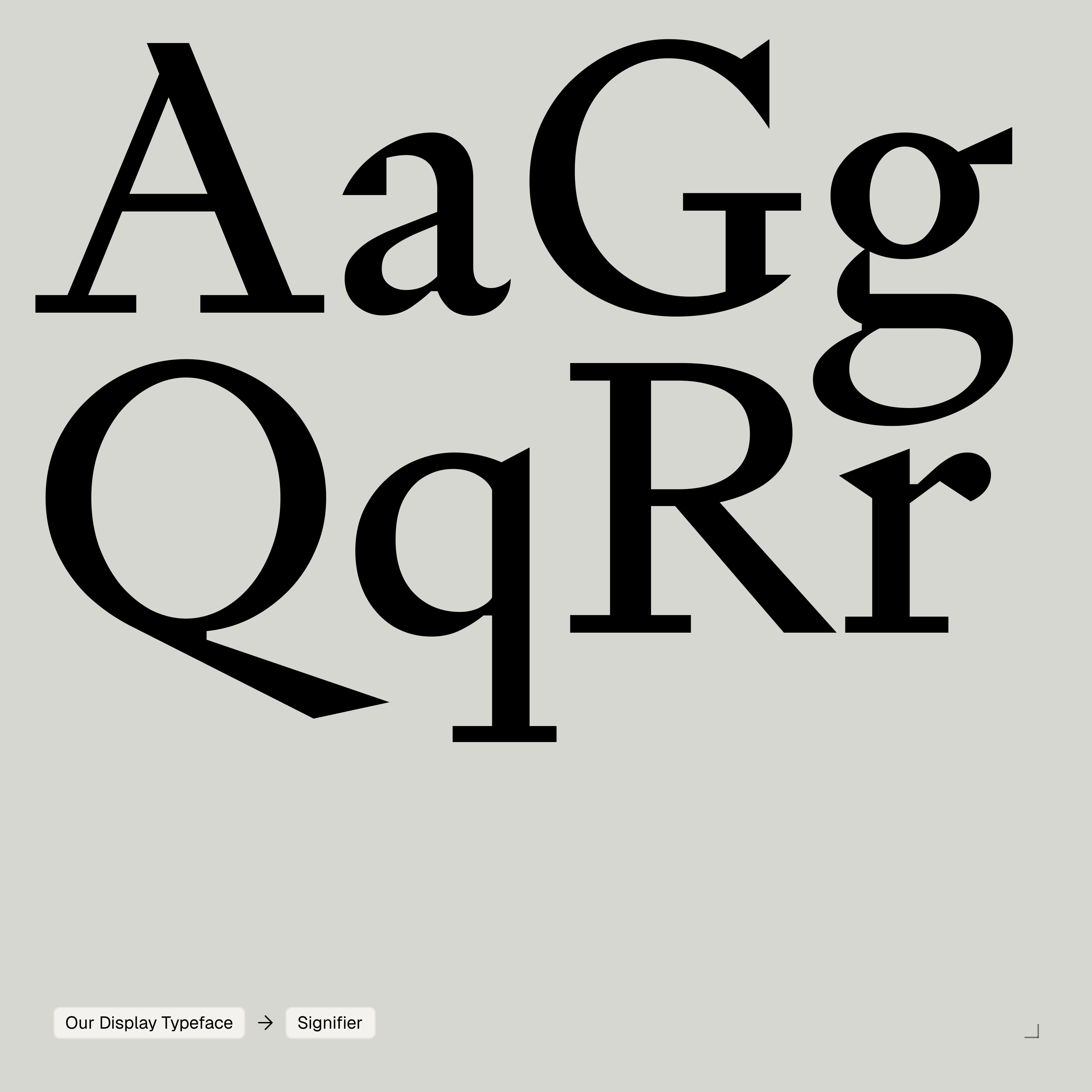
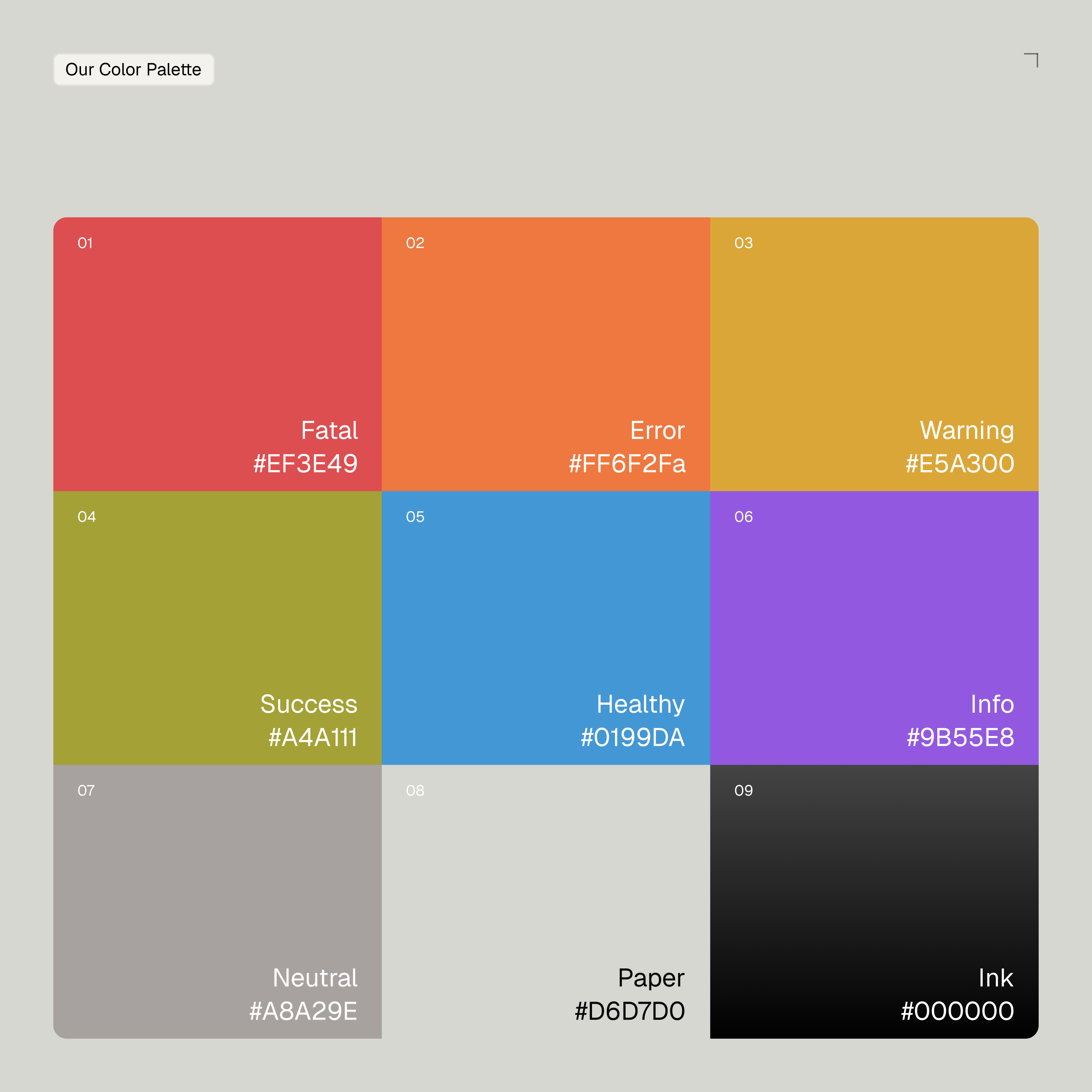
Typographically, we look to Signifier as the primary brand typeface. It’s a modern expression of editorial type that still feels chiseled and precise, which we love. The color palette is just complex enough to cover every product status, while staying monochromatic everywhere else.
Interaction with Purpose
Throughout the site, we believe interaction should help explain the product, not just decorate it. For instance, an interactive representation of Antimetal’s “world model” shifts between chaos and organization, illustrating how the platform brings organization to complex infrastructure. Our custom “Antimetal ink” texture subtly follows the cursor, adding a nice layer of depth throughout. Overall, we wanted the site to feel rewarding to explore, with diagrams, motion, and micro-animations inviting visitors to engage with the content. One of our favorite details is the Antimetal logo transforming into the page’s reading progress bar.
Making the Stack Make Sense
Another favorite, if we do say so ourselves, is a diagram showing Antimetal’s role in the modern development stack. By showing exactly where Antimetal fits into existing infrastructure, we can explain not only what the product does, but where it lives. It turns a technical concept into something intuitive, helping visitors get it before they ever read a paragraph of copy.
Technical doesn't have to be dry
Antimetal regularly publishes ambitious research, so we developed an editorial art direction that could live alongside their writing. Inspired equally by blueprints, technical diagrams, and academic publishing, the system gives abstract ideas a visual language that feels intelligent, textural, and easy to expand as the library continues to grow.
Keep Poking Around
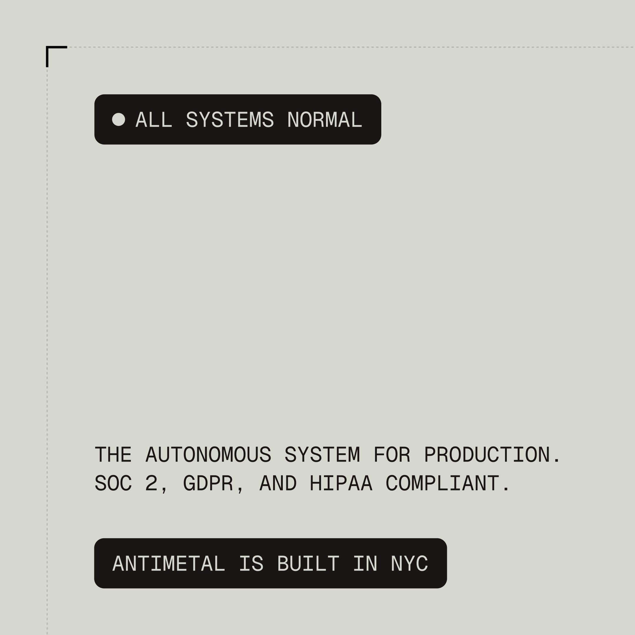
Subtle interactions and hidden moments make the site rewarding to explore: clicking the Antimetal logo shuffles it into endless permutations, while the “All Systems Normal” tag in the footer displays the current system status.
A Little Dev Flex
You didn’t hear it from us, but pressing Escape on the homepage launches the Antimetal mark as an interactive, flyable ship. Pilot it around the page and blast apart the website itself. As we designed and developed the entire site in-house, it gave us plenty of opportunities to sneak in moments like this. Part Easter egg, part dev flex, and very much Antimetal.
Services
Client
Antimetal