Mayku Brand Identity
Mayku is more than an innovative product — it’s a technological movement that empowers all people to become makers. So having the chance to develop an identity system for these rad folks and their rad idea was a dream come true.
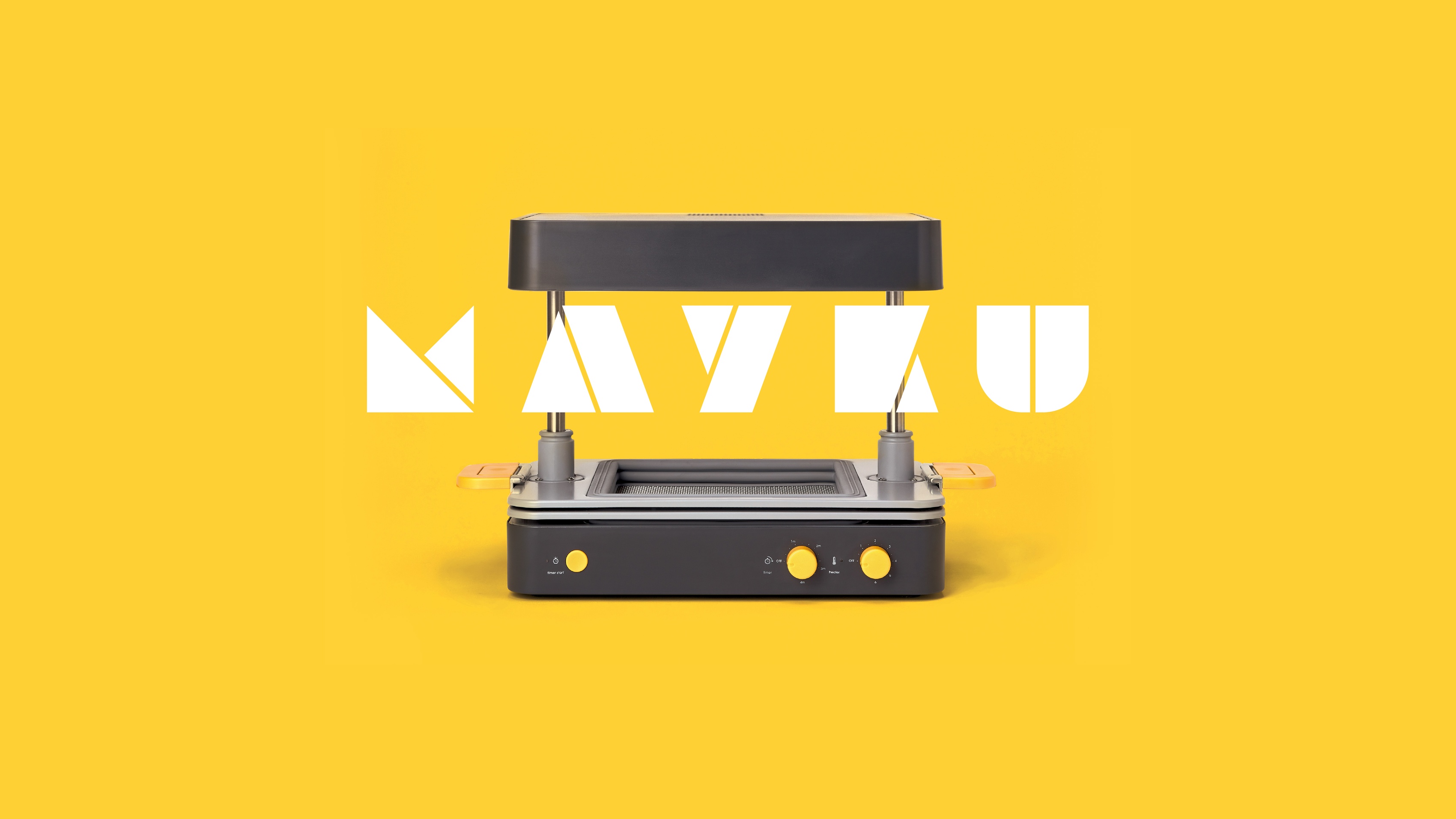
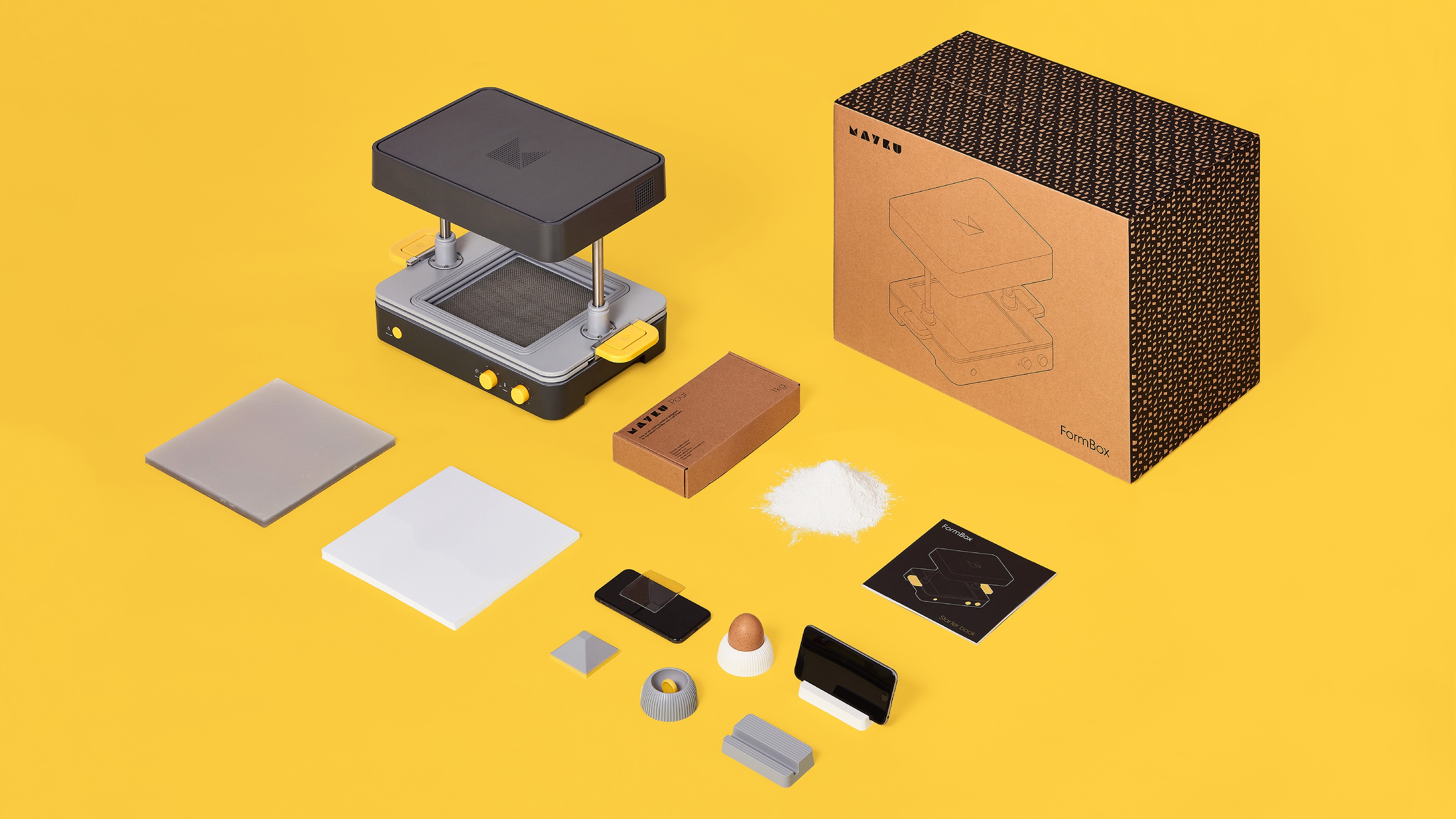
The Mayku team hit us up just after wrapping a successful Kickstarter campaign for their flagship product called the FormBox, which is a compact vacuformer that allows anyone to turn their desktop into a prototyping factory. The FormBox is smart because it opens the world of product design to everyone from beginners (with it’s easy and approachable process) to industry professionals (when paired with 3D printers and other prototyping tools).
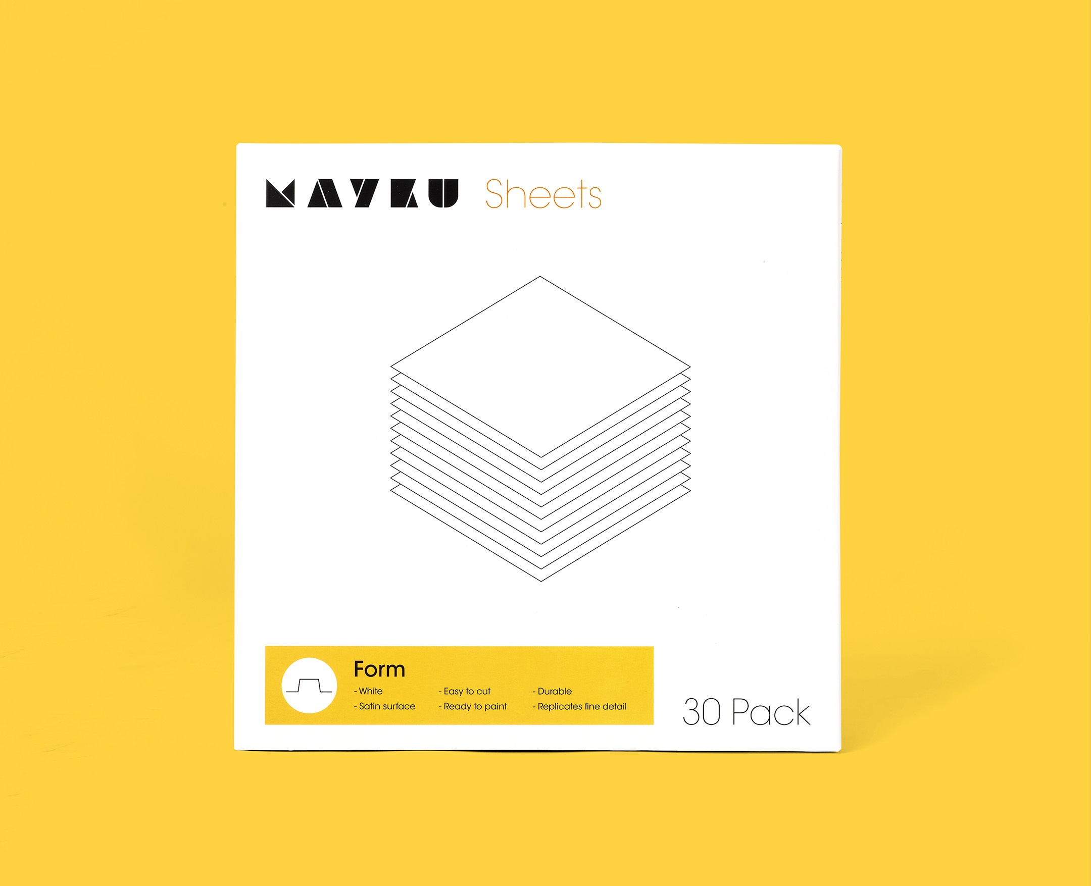
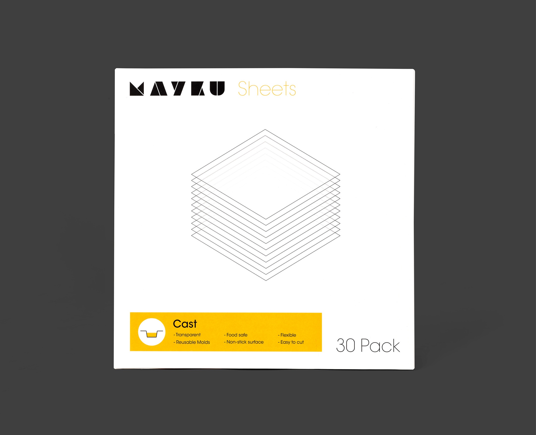
We worked closely with the team to develop a simple and powerful holistic identity system — including the logo, typography, color palette, packaging, animations, and the look and feel of the FormBox itself.
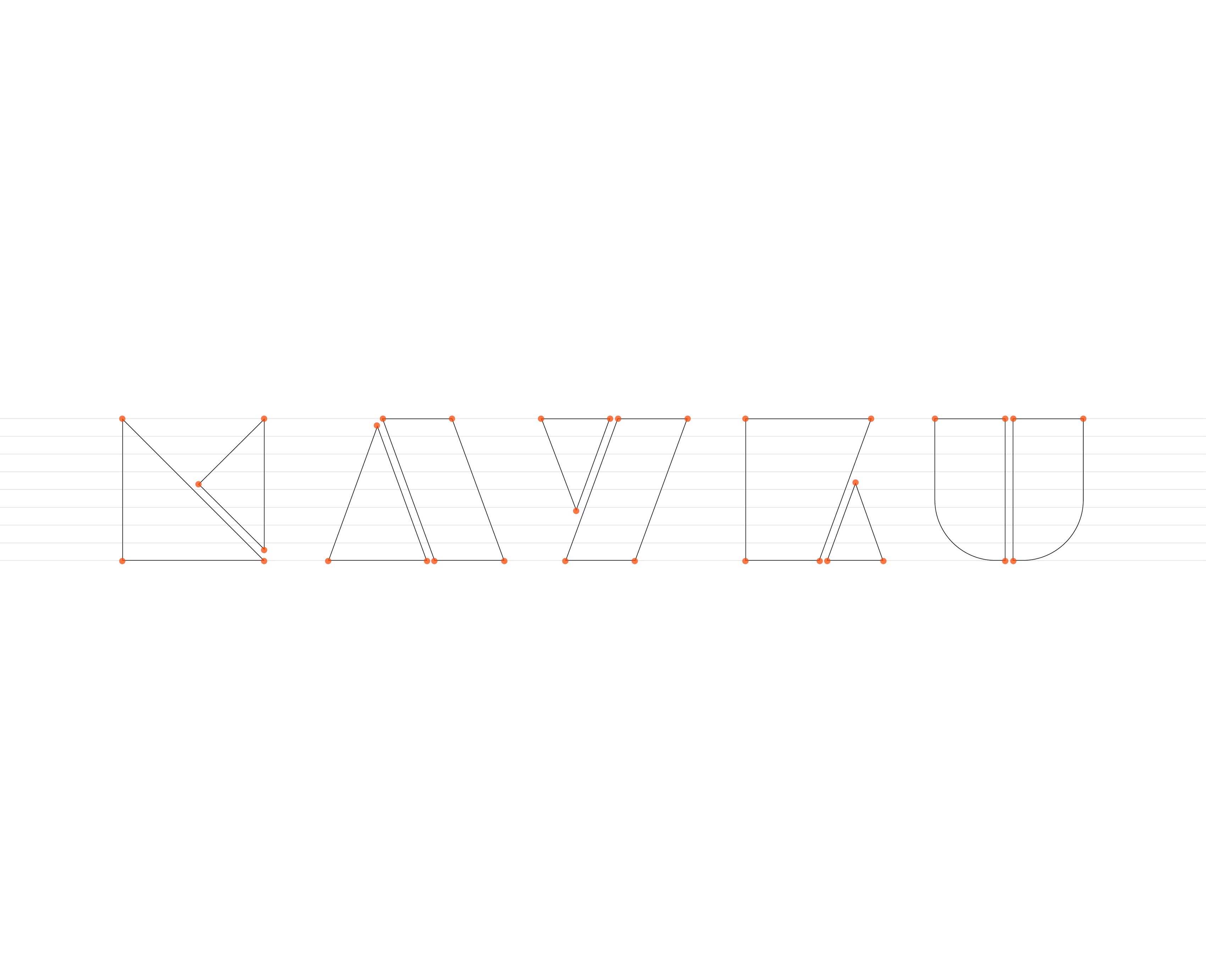
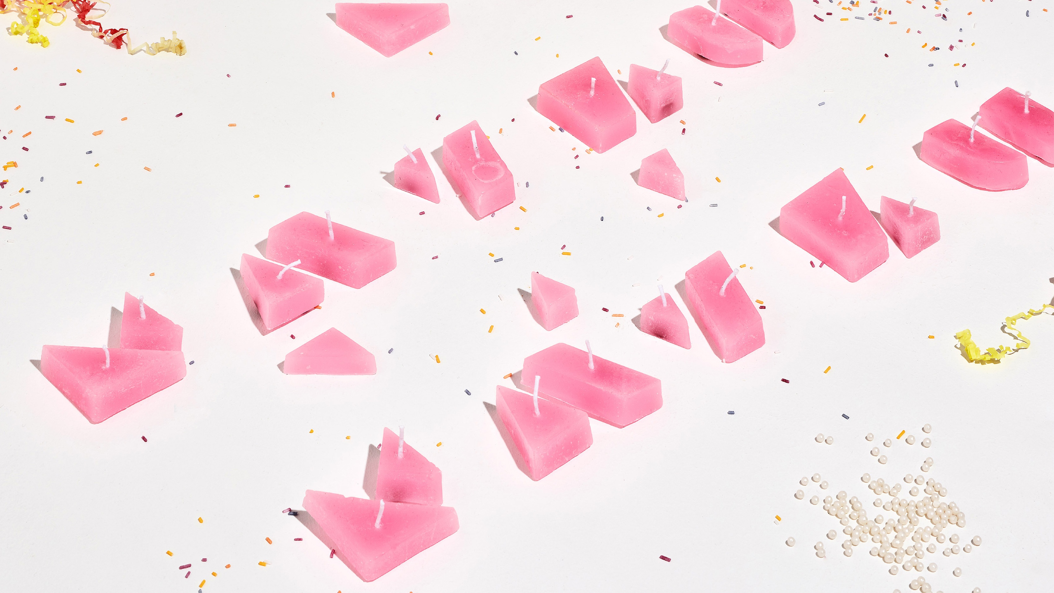
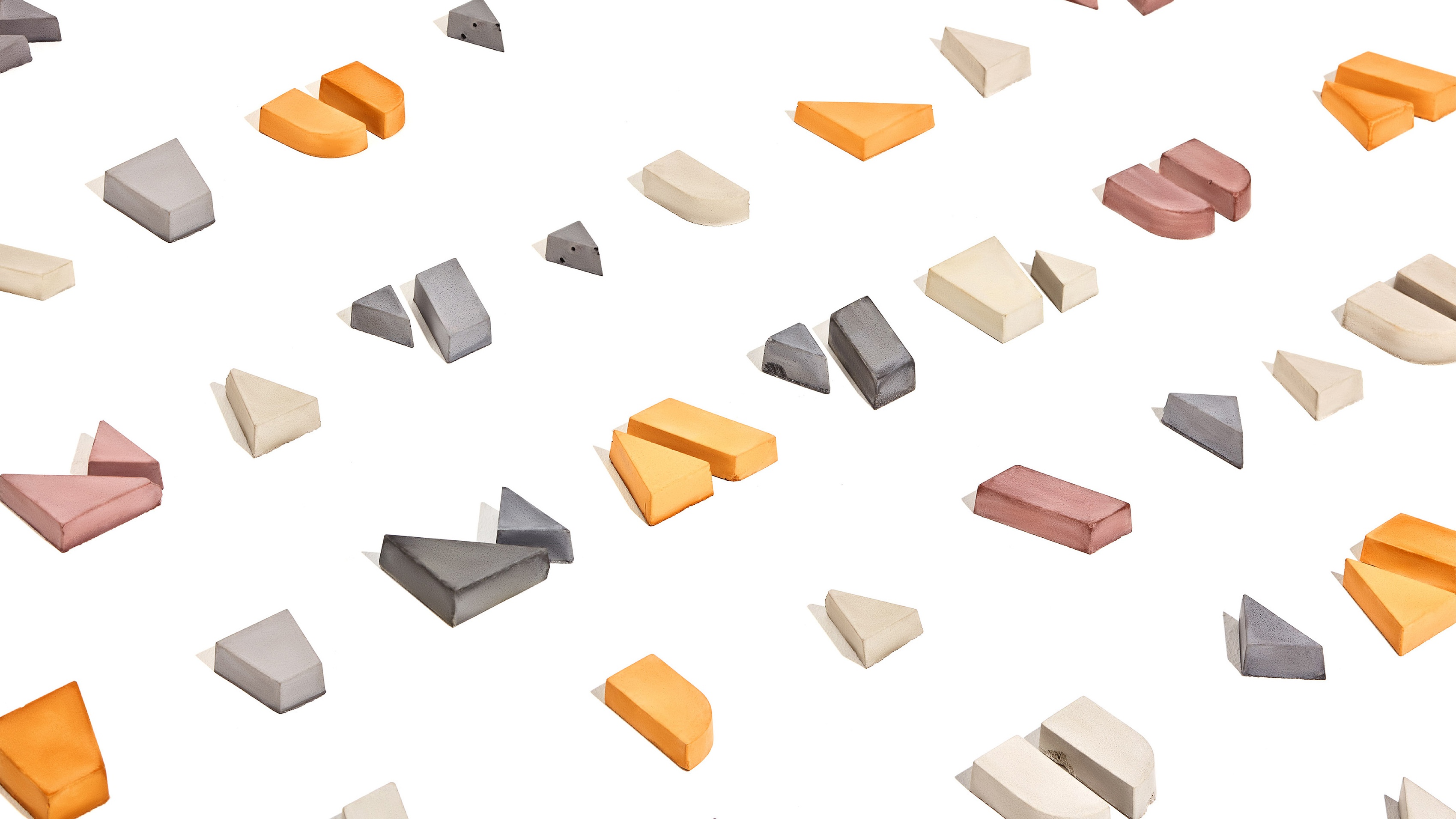
The wordmark and icon are inspired by the insight that Mayku empowers users to build products simply. The letterforms in the mark are created from simple, modular shapes that can break apart and rebuild. We also used the FormBox itself to recreate the wordmark with several distinct materials.
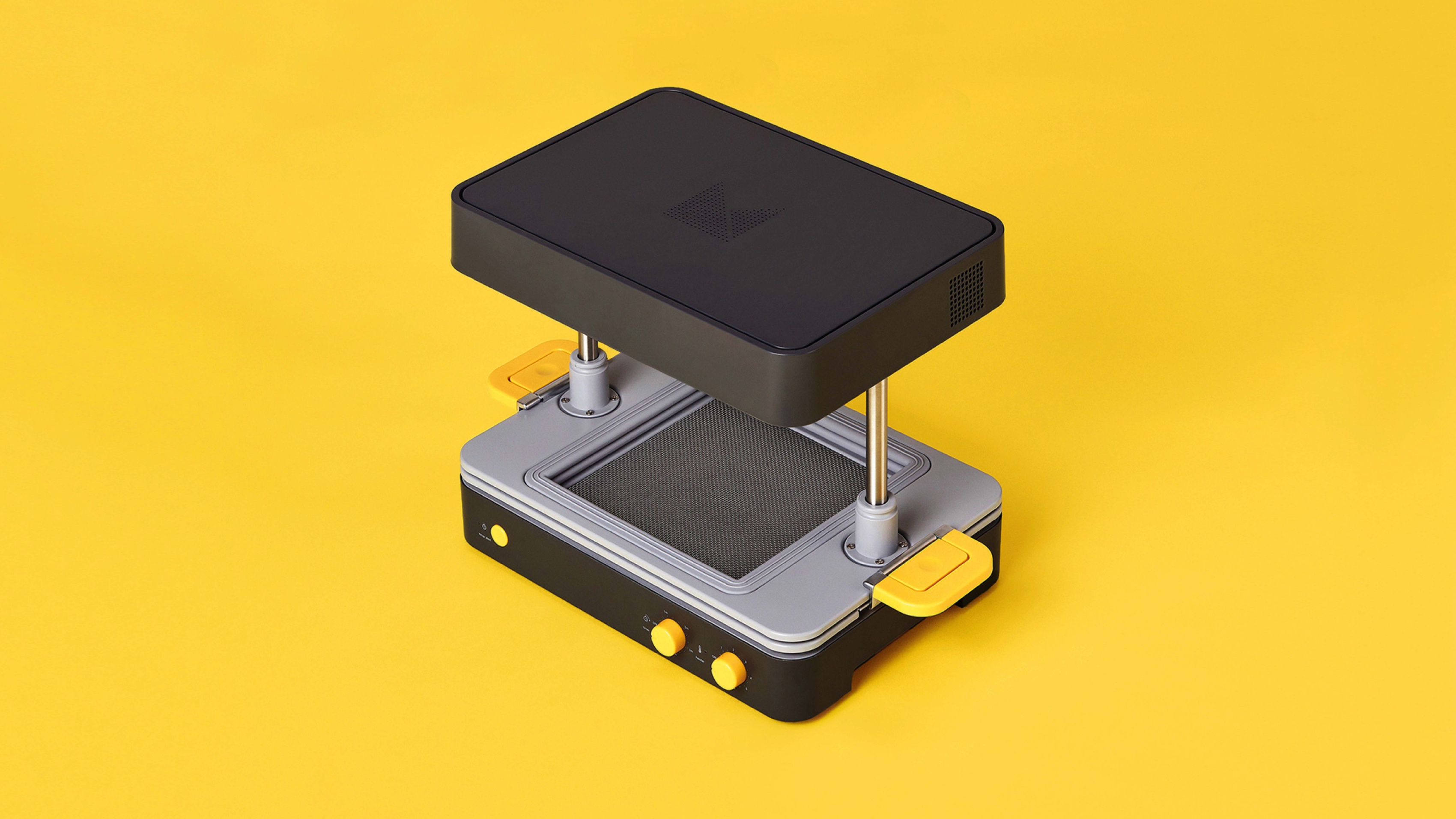
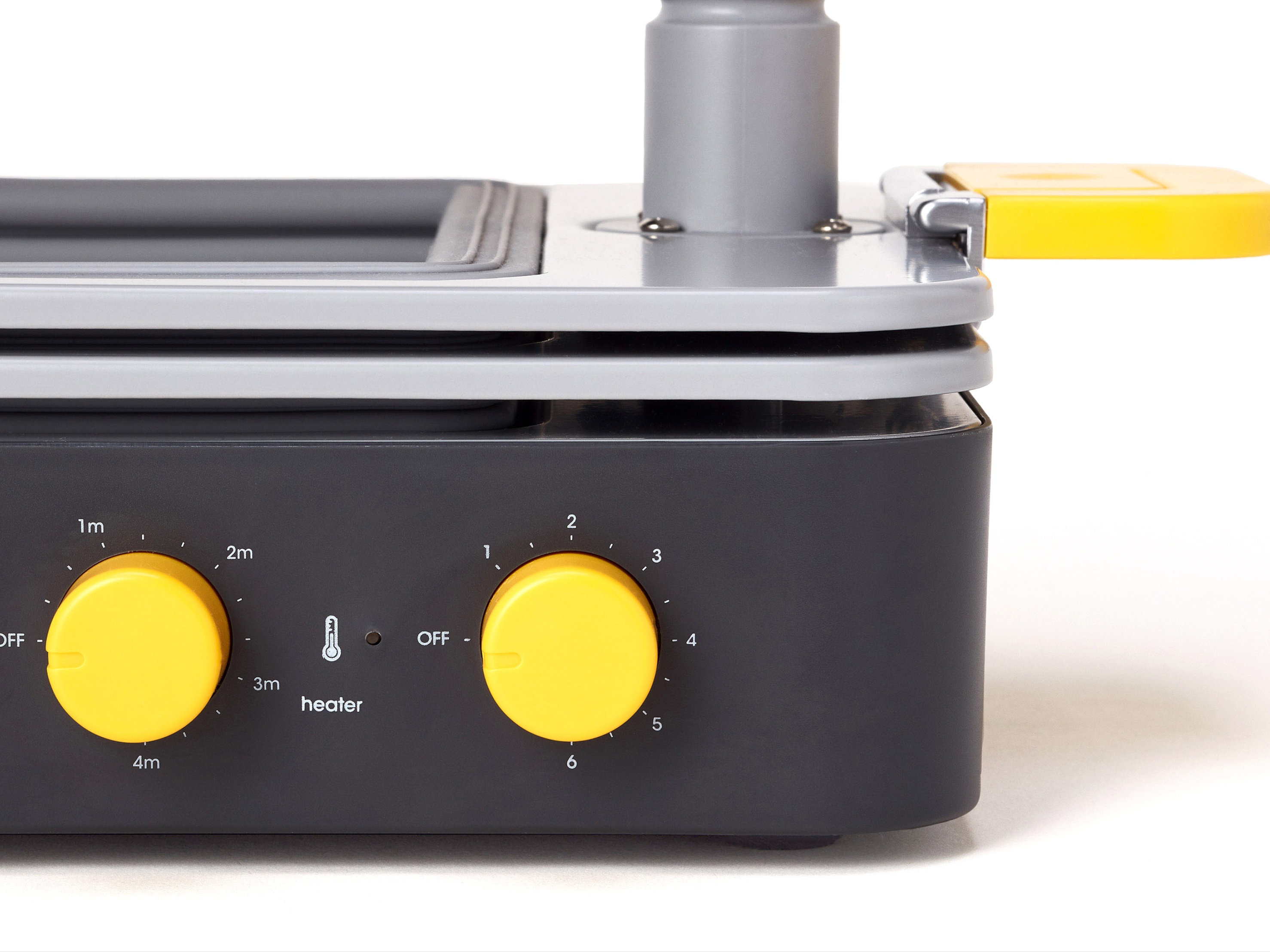
The color system is bright and punchy — and features on the packaging, website, and on the product. Whenever a color is used, it’s meaningful in its application. For example, any element on the Formbox that someone physically interacts with (a handle, a dial, a button) is yellow. On the packaging, the “FormBox Yellow” clearly identifies FormBox products. This is an expandable system — so as Mayku adds additional products alongside the FormBox, they’ll have their own distinct colors.
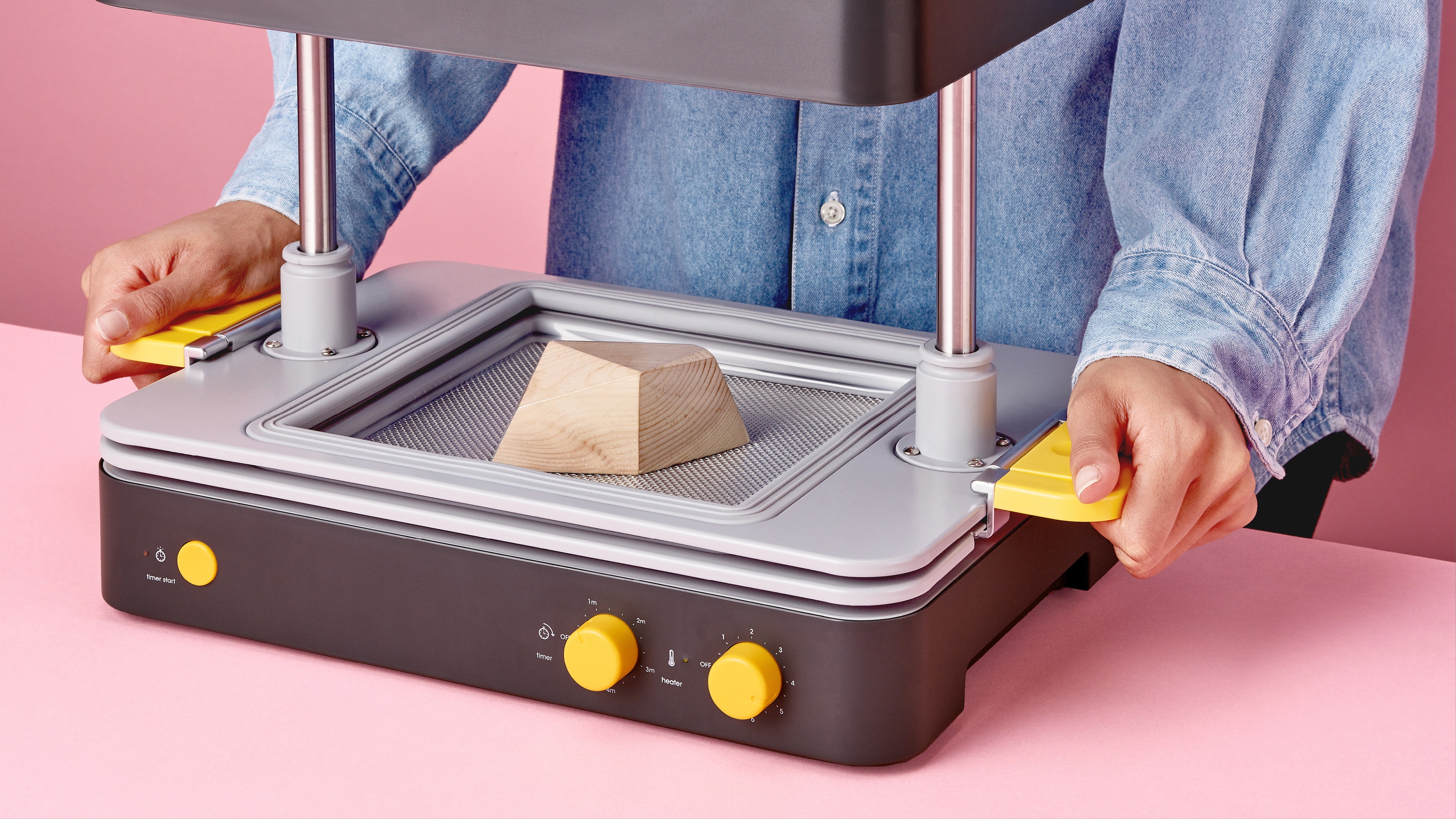
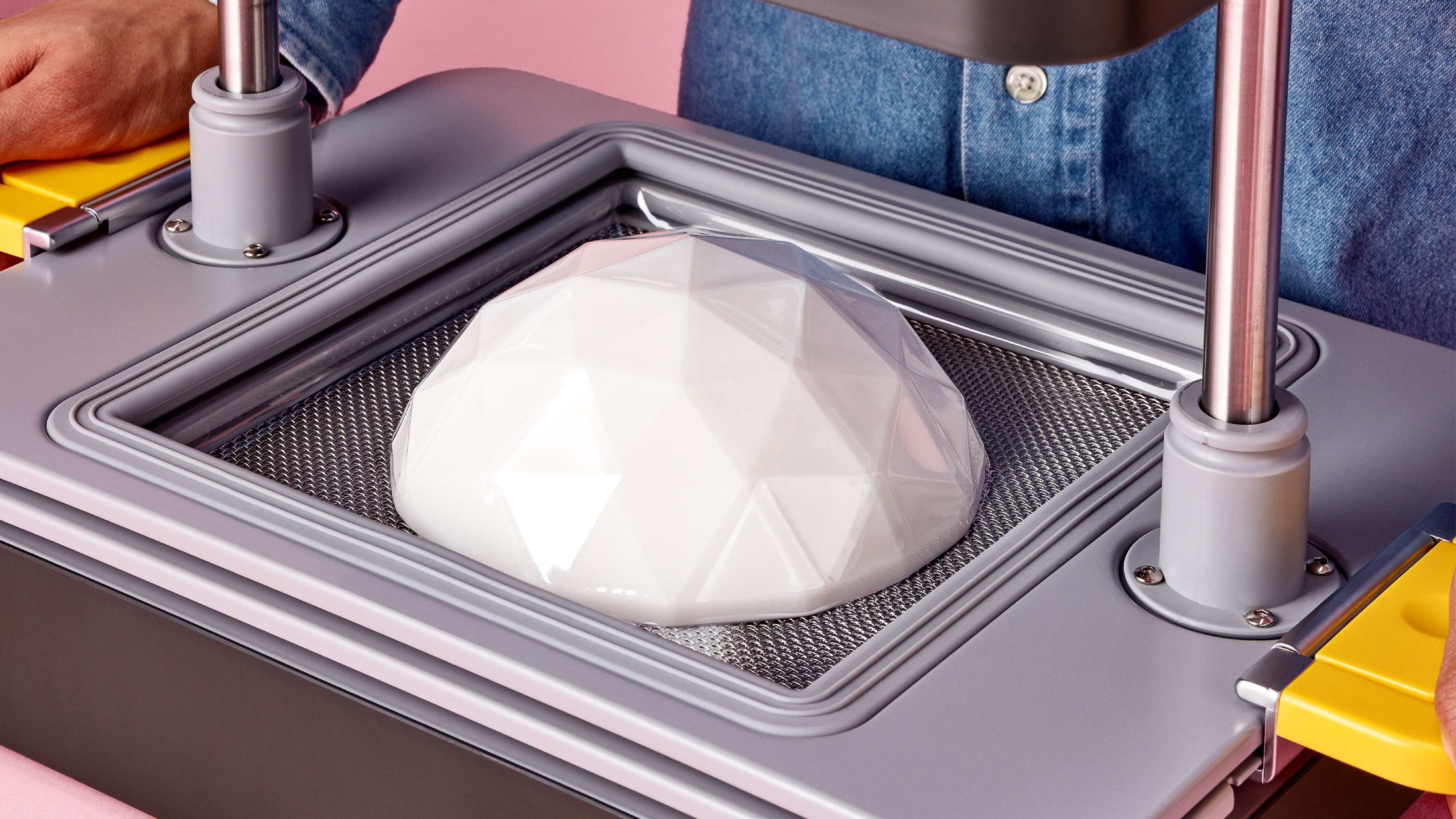
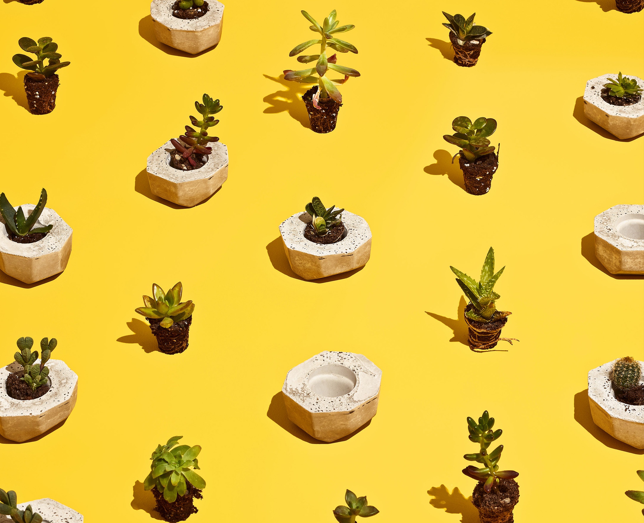
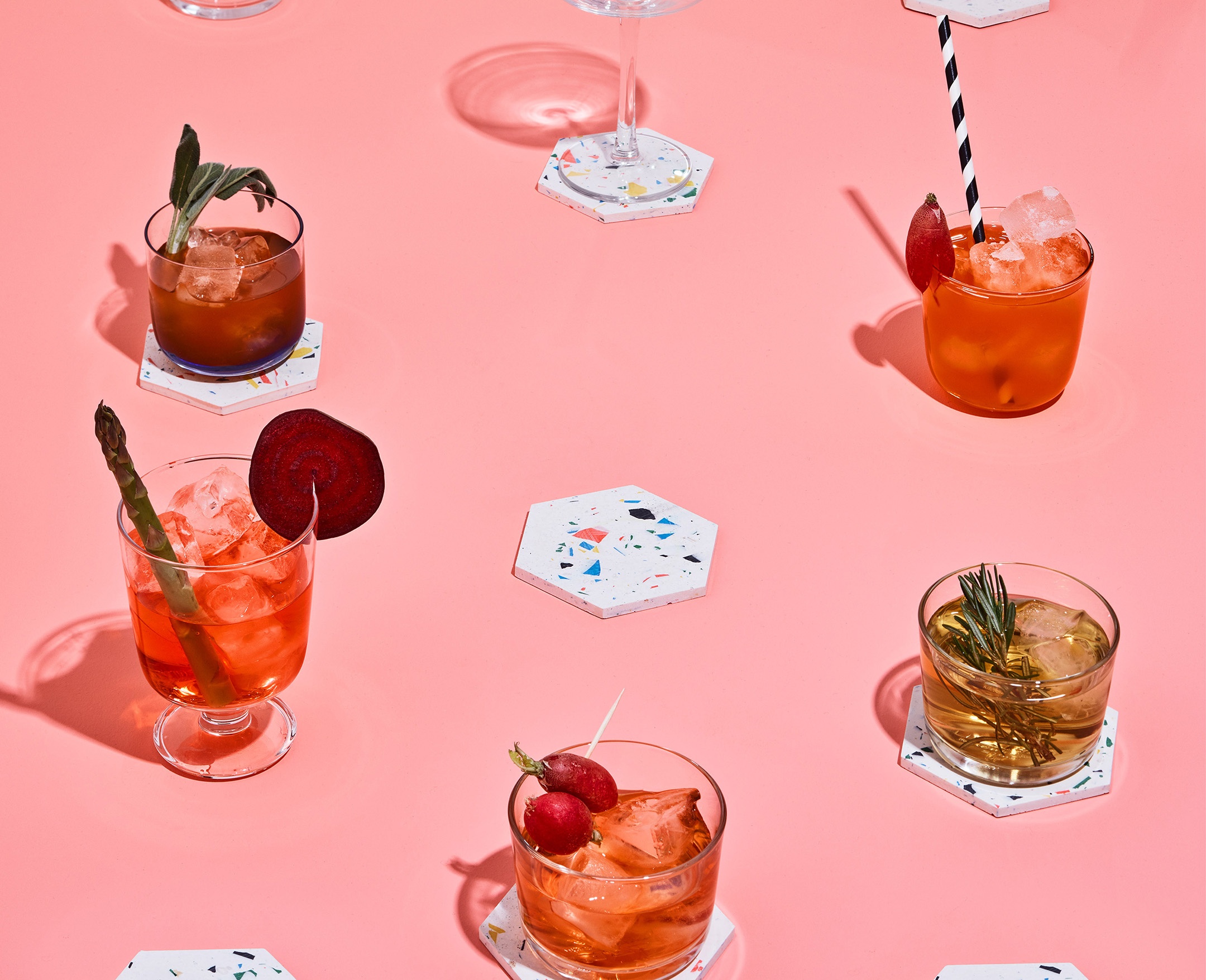
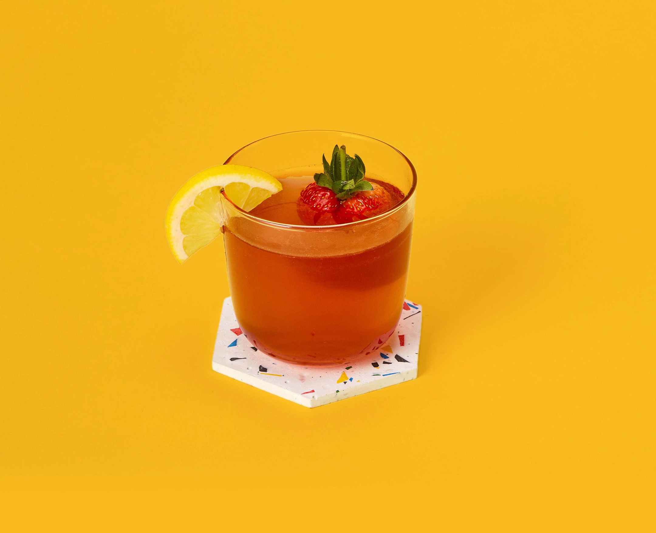
We also created a simple and clear art direction style for the brand photography. Products are shot on flat colored backgrounds, and “how-to” videos are clean and approachable.