
Decoding as a visual langage
Tidbit about how Space Doctors process is rooted in semiotics, the study of signs + symbols, which lead us down the road of symbolism and human meaning-making, prompting early ideas related to things like “reading tea leaves”. I think these few sentences could be an interesting peak into our own process and thinking.
An Early Discovery
Explanation of chladni concept, how it relates to the Space Doctors ethos/process. Since we just introduced the semiotics idea, this could be a really easy explanation as it’s almost a slam dunk metaphor: “Observing how the landscape shakes out and acting from there”
TCW went a step further with this concept, developing the chladni formulas into a reusable tool for generating patterns, overlays, and masks.
Iconography and Symbols
We created a set of icons which function as abstract symbols for Space Doctors’ strategic processes . The forms also echo the organic nature of our foundational Chladni patterns.
A Flexible Framework for Imagery
A Flexible Framework for Imagery
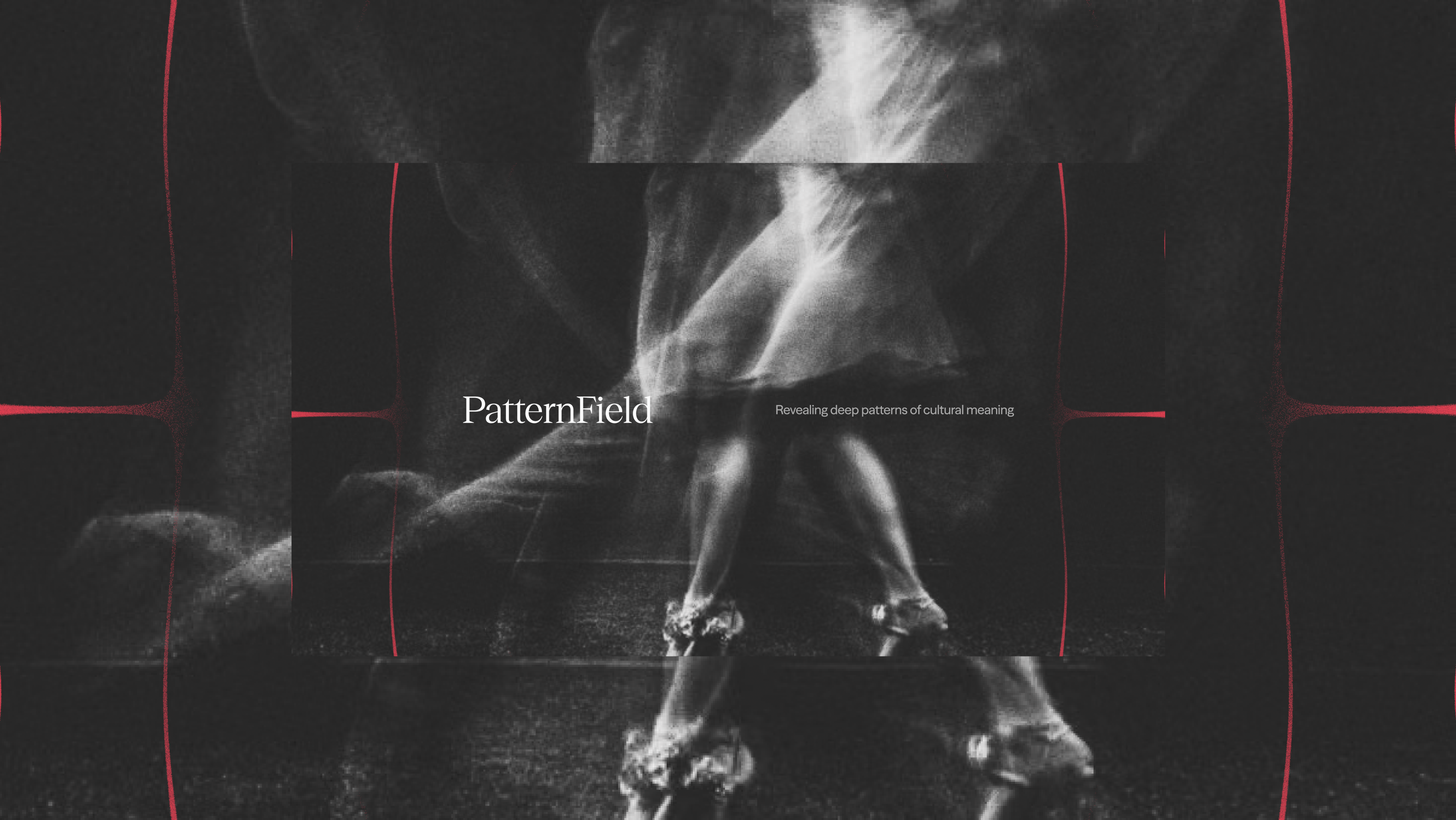
Space Docs has a massive library of imagery they use for storytelling, texture, and [...] They have a consistent need to be able to present these images in branded ways, so they needed a lot of options for framing devices.
The chladni forms can be used for much more than simple overlays or patterns. Extrapolating from commonly appearing forms within the patterns, we defined a shape language for masking and distorting imagery [...]
Space Doctors in the Real World

Tamara Connolly, Space Doctors
“The Collected Works was able to translate our cryptic and often misunderstood framework into really understandable and clever visual solutions. We’re stoked with the outcome, and couldn’t have had a better working relationship.”
Services
Client
Space Doctors